
Authors:


Overview
This article series is a comprehensive exploration of the development process for a proprietary web application, leveraging React.js, Node.js, LSEG UI Elements and Workspace SDK. Building upon the foundational concepts introduced in the initial article Building a proprietary web application with Workspace SDK: Options RIC search use case, this article is the fourth in the series - dives deep into the integration of LSEG UI Elements, demonstrating the creation of a custom user interface. We will show how to use the UI Elements, including buttons, cards, charts, and dialogue boxes.
Moreover, it will provide helper functions for creating tables and handling submit, click, and delete actions. Through this article we will set the ground for implementing the last piece of the Workspace SDK - Workflow Library to navigate to Workspace from our app, and Data Library for Typescript to show live data in the browser.
Section 1. React Application Structure
Architectural Elements of React
React application follows a component-based structure, emphasizing modularity and reusability of the components. The entry point for our application is the index.tsx file, which kickstarts the application and defines the navigation using React Router, providing single-page application experience. We use <Routes> component, defining the different views within our application as shown below:
root.render(
<BrowserRouter>
<Navbar />
<Routes>
<Route path='/' element={<Home />} />
<Route path='/findingRICs/constructRIC' element={<ConstructRIC />} />
<Route path='/findingRICs/showRIC' element={<ShowRIC />} />
<Route path='/findingRICs/pricesChart/:id' element={<ShowPricesChart />} />
</Routes>
<Footer />
</BrowserRouter>
);
Apart from defining the routes to our application pages (constructRIC, ShowRIC and the PricesChart) which we will discuss in the subsequent sections we included the navigation bar (<Navbar />) and footer (<Footer />) to provide a consistent layout across different pages of the app. You can check it out in the GitHub repo of the project.
Throughout the project we use React hooks, particularly useState and useEffect, handling state management within components. This enables us to implement asynchronous operations, such as fetching data seamlessly without blocking the user interface. We also use event handlers like onSubmit and onClick to ensure responsive interactions on submissions or responding to user clicks.
React application UI with Element Framework
For the consistent look and feel of our application we are using LSEG Element Framework which provides components and tooling, aligned with LSEG Workspace's design system, to help developers build applications faster and more efficiently.
The Element Framework is compatible with all major Javascript frameworks like React,Angular and Vue etc. The framework can be installed using npm package manager:
npm install @refinitiv-ui/elements
In addition, we need to install the Halo theme which is the official theme for the Workspace . It is provided to correctly initialise our application with correct styling and typography.
npm install @refinitiv-ui/halo-theme
To start using components we need to import the component definitions and themes in our code. Below we show how to import some of the components we used in our application:
import '@refinitiv-ui/elements/panel';
import '@refinitiv-ui/elements/panel/themes/halo/light';
import '@refinitiv-ui/elements/button';
import '@refinitiv-ui/elements/button/themes/halo/light';
import '@refinitiv-ui/elements/datetime-picker';
import '@refinitiv-ui/elements/datetime-picker/themes/halo/light'
It should be noted that the theme can easily be changed to dark by replacing light to dark in the import statement of the theme.
import '@refinitiv-ui/elements/panel/themes/halo/dark;
More about the supported components can be found in the official documentation of the Element Framework. Additionally, to ensure the cohesive design we have provided a css object for our application accessible on the GitHub repo.
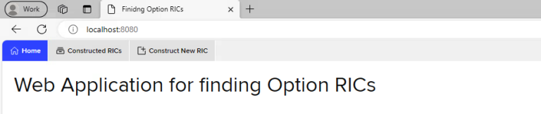
Below is shown how the entry page of our application looks like:
Section 2: Constructing Option RIC - UI Elements for the request form
In this section, we show how the form for RIC search under '/findingRICs/constructRIC' layout is built, what the submit does and how the submission output is handled depending on the type of the submission response.
Styling and Layouts for the RIC search form
To build the request submission form we use several components of the Element Framework including card, text-field, number-field, datetime-picker and select component.
The form is wrapped under an <ef-card/> component, followed by a span for the form header as shown below:
<ef-card class="card">
<span slot="header"><b>Construct Option RIC</b></span>
<form onSubmit={handleSubmit} id="requestForm">
{/* Form components going here */}
</div>
<div className="btnHolder">
<button disabled={loading}>
{loading ? 'Loading' : 'Get the results'}
</button>
</div>
</form>
</ef-card>
As it comes to the form itself it includes the form components (some of them shown below in this section), a submission button which handles the form submission associated with the handleSubmit function. Before discussing the handleSubmit function below we present how we defined the form components:
<div >
<label htmlFor="asset">Asset RIC/ISIN</label>
<ef-text-field class="inputField" id="asset" value="BARC.L" placeholder="Insert asset RIC or ISIN"></ef-text-field>
</div>
<div>
<label htmlFor="maturity">Maturity
date</label>
<ef-datetime-picker class="inputField" id="maturity" value="2023-03-18" placeholder="Maturity date in yyyy-mm-dd"></ef-datetime-picker>
</div>
<div>
<label htmlFor="strike">Strike</label>
<ef-number-field class="inputField" id="strike" value='210' step="0.01" placeholder="Insert strike price"></ef-number-field>
</div>
<div >
<label htmlFor="colFormLabelSm" className="col-sm-6 col-form-label col-form-label" >Option
type</label>
<ef-select class="inputField">
<ef-item value="Call" selected>Call</ef-item>
<ef-item value="Put">Put</ef-item>
</ef-select>
</div>
The form incorporates several components designed to gather essential information about the option, including the asset RIC/ISIN, maturity date, strike price, and option type. To maintain a consistent appearance, we've employed specific LSEG UI Elements for each input. Specifically, <ef-text-field/> is used for the RIC/ISIN, <ef-datetime-picker/> for the maturity date, </ef-number-field> for the strike price, and <ef-select/> with <ef-items/> for the selection of the option type. Additionally, we have incorporated placeholders within the input fields, complemented by default values for an intuitive user experience.
Handling form submission
Now let’s delve into the functionality that handles the submission of the "Construct RIC" form. Let's walk through the handleSubmit function and understand how it manages the asynchronous process of sending user input to the backend for Option RIC construction.
const handleSubmit = async (event: any) => {
setLoading(true);
event.preventDefault();
let res = await fetch('http://local host:4000/findingRICs/constructRIC', {
method: 'POST',
body: JSON.stringify({
asset: (document.getElementById('asset') as HTMLInputElement).value,
maturity: (document.getElementById('maturity') as HTMLInputElement).value,
strike: (document.getElementById('strike') as HTMLInputElement).value,
optionType: document.querySelector("ef-select").value,
}),
headers: { 'content-type': 'application/json' }
})
if (res.status === 200) {
setStatus((res as any).status)
res = await res.json()
setData(res as any)
}
setLoading(false)
};
The handleSubmit function is triggered when the user submits the form we have defined above. It begins by setting the loading state to true, indicating the start of the submission process. The event.preventDefault() prevents the default form submission behaviour, ensuring that the form data is handled through our custom logic before any default actions take place.
Next, a fetch request is made to the backend API endpoint at 'http://local host:4000/findingRICs/constructRIC'. This endpoint is responsible for constructing the Option RIC based on the provided user input gathered from the form input fields containing the asset, maturity date, strike price, and option type. More on what this endpoint does can be found in our previous article of the series - Building proprietary back-ends: Using Node.js, Express Framework, and Mongoose for web application development | Devportal (lseg.com).
Upon receiving the backend response, the code checks if the status is 200 (OK). If it is, the status is updated, and the response data is parsed as JSON. The parsed data is then set using the setData function, indicating a successful response from the backend.
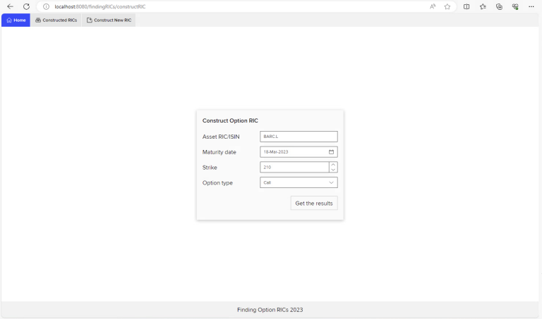
Finally, the loading state is set to false, signalling the end of the submission process. Below is the screen of the request form:
Next, let’s explore how the retrieved data is used to update the UI and display the constructed Option RIC to the user or provide the respective feedback to the user if no option RIC was found by the provided user input.
Handling request output
Below we handle the output and presentation of data obtained from the backend after submitting the "Construct RIC" form. The primary goal here is to dynamically generate dialogue boxes based on the backend response, providing users with feedback on the success or failure of the RIC construction process.
{(data as any || []).map((element: any, index: number) => {
if (element !== null && status as any === 200) {
return showFoundRICDialogue(element, index, handleClick)
}
else if (element === null && status as any === 200) {
return showNoFoundRICDialogue(element, index, handleClick)
}
else {
return null
}
})}
This snippet is using the data received from the backend (stored in the data state) to dynamically generate dialogue boxes. The map function iterates over the data array, and for each element, it checks whether the RIC construction was successful or not. Based on the conditions, it calls one of two functions to display the appropriate dialogue box.
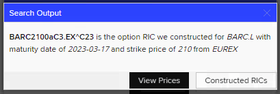
Let's explore the dialogue box functions starting with the one with successful response. showFoundRICDialogue function below is responsible for displaying a dialogue box when the RIC construction is successful. It dynamically adjusts the content and buttons based on the nature of the constructed RIC.
export function showFoundRICDialogue(element: any, index: any, handleClick: any) {
let handleClickText = "View Prices"
let handleClickInstrument = handleClick
if (element.ric.indexOf("^") === -1) {
handleClickText = 'Instrument overview'
handleClickInstrument = function () {
wsdkHelper.openApp("OV", element.ric, 'tab')
}
}
return (
<ef-dialog id="d1" header="Search Output" opened key={index}>
<div >
<p>
<b>{element.ric} </b> is the option RIC we constructed for <i> {element.asset}</i> with maturity date of <i>
{element.maturity} </i> and strike price of <i>
{element.strike} </i> from <i>
{element.exchange} </i>
</p>
</div>
<div slot="footer" >
<ef-button class="viewBtnDialogue" data-url={`/findingRICs/pricesChart/${element._id}`} onClick={handleClickInstrument}>{handleClickText}</ef-button>
<ef-button class="viewConstructedRICs" data-url={`/findingRICs/showRIC`} onClick={handleClick}>Constructed RICs</ef-button>
</div >
</ef-dialog>
)
}
We use <ef-dialog/> layout from the Element framework to present the output. The handleClickText and handleClickInstrument variables determine the text and functionality of the primary button in the dialogue box. If the RIC doesn't contain the character "^," it implies it's the option is still active, and the button is configured to open an instrument overview using the Workspace SDK. More to be found in our upcoming article for Workspace SDK.
The dialogue box contains information about the constructed RIC, including the RIC itself, the associated asset, maturity date, strike price, and exchange. Additionally, two buttons, again configured using button components of the Element framework, are provided in the footer: one for viewing prices chart and another for viewing all constructed RICs, both to be presented in the subsequent sections of this article.
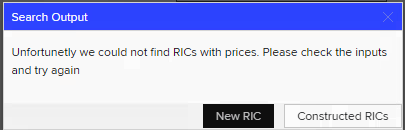
To handle unsuccessful response from the backend , we define a function named showNoFoundRICDialogue. It informs the user that no RICs with prices were found and suggests checking the input and trying again.
export function showNoFoundRICDialogue(element: any, index: any, handleClick: any) {
return (
<ef-dialog id="d1" header="Search Output" opened key={index}>
<p>Unfortunetly we could not find RICs with prices. Please check the inputs and try again</p>
<div slot="footer" >
<ef-button class="viewBtnDialogue" data-url={`/findingRICs/constructRIC`} onClick={handleClick}>New RIC</ef-button>
<ef-button data-url={`/findingRICs/showRIC`} onClick={handleClick}>Constructed RICs</ef-button>
</div >
</ef-dialog>)
}
Two buttons in the footer allow the user to initiate a new RIC search or navigate to view all constructed RICs.
Section 3: Managing Constructed RICs
In this section of our React application, we focus on the presentation of the constructed RICs in a tabular format using DataTables library. Let's walk through the ShowRIC component and understand how it fetches data from the backend and renders it in a DataTable.
Fetching the data
export default function ShowRIC() {
const [data, setData] = React.useState([]);
React.useEffect(() => {
(async () => {
let res = await fetch('http://local host:4000/findingRICs/showRIC');
if (res.ok) {
res = await res.json()
setData(res as any)
}
createDatatable(setData, res)
})()
}, []);
return (
<div className="dataTable">
<h3 className='titleTable'> Table of found RICs</h3>
<table id="showRICs" className="display" width="100%"></table>
</div>
)
The ShowRIC component utilizes the useState and useEffect hooks from React. useState hook initializes the data state as an empty array. This state will later hold the data fetched from the backend. Then the useEffect hook is used to execute the data-fetching logic when the component mounts. It contains an asynchronous function that fetches data from the backend API endpoint 'http://local host:4000/findingRICs/showRIC'. More on what this endpoint does can be found in our previous article of the series - Building proprietary back-ends: Using Node.js, Express Framework, and Mongoose for web application development | Devportal (lseg.com).
If the fetch is successful the response is converted to JSON, and the setData function is used to update the data state with the retrieved data. The createDatatable function is then called, passing the setData function and the fetched response.
Rendering the DataTable
The returned JSX renders a div with the className "dataTable" containing a <table> element which will be transformed into a DataTable using the DataTables library.
The transformation is implemented via createDatatable function which creates the DataTables table with the data coming from our backend. We use the following function to create the columns of table and populate the data into it:
function createColumns(res: any) {
let columns: any[] = []
const features = Object.keys(res[0])
features.forEach(function (element) { if (element !== "prices" && element !== "__v") { columns.push({ data: element, title: element }) } })
columns.push({ data: null, title: "To Workspace" })
return columns
}
We won’t be showing the further details of the DataTable rendering in the scope of this article, but will concentrate on the pieces concerning the Element Framework components used within the function. As it comes to the complete function, feel free to check it out in the GitHub repo. Below let’s have a look at the rendering of the page containing the datatable.
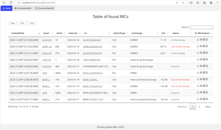
The section where we utilize the Element Framework is the column called “To Workspace” where we show icons coming from <ef-icon/> element of the Framework. To implement that we used the columnDefs parameter of the DataTables library as shown below:
{
targets: -1,
createdCell: (td: any, cellData: any, rowData: any, row: any, col: any) => {
ReactDOM.render(
<div id="icons">
<span title="See instrument price chart in Workspace">
<ef-icon icon="chart-line-bar" id="chartWorkspace" onClick={() => wsdkHelper.openApp('CHT', rowData.ric, 'popup')}></ef-icon>
</span>
<span title="See instrument price">
<ef-icon icon="display-all-fields" id="pricesChart" data-url={`pricesChart/${rowData._id}`} onClick={handleClick} ></ef-icon>
</span>
<span title="See instrument quotes in Workspace">
<ef-icon icon="open-quote" id="quotesWorkspace" onClick={() => wsdkHelper.openApp('Q', rowData.ric, 'popup')}></ef-icon>
</span>
<span title="Delete the record">
<ef-icon icon="dsc-delete-chart" id="delete"></ef-icon>
</span>
</div >, td)
},
className: 'dt-body-center'
}
In the code snippet above, we've integrated four distinct icons from the Element Framework. Each icon is specified within the <ef-icon/> element, such as for the line bar icon: <ef-icon icon="chart-line-bar">. For a comprehensive compilation of available icons within the Element Framework and insights into customization options, please refer to our documentation here.
Beyond their static representation, the icons have been made interactive by leveraging the onClick event handler. For example, "display-all-fields" icon reveals prices dynamically, whereas, icons labelled "chart-line-bar" and "open-quote," open the Chart or Quote app within Workspace via the SDK. For an in-depth exploration of Workspace SDK capabilities, stay tuned for our upcoming article dedicated to the Workspace SDK.
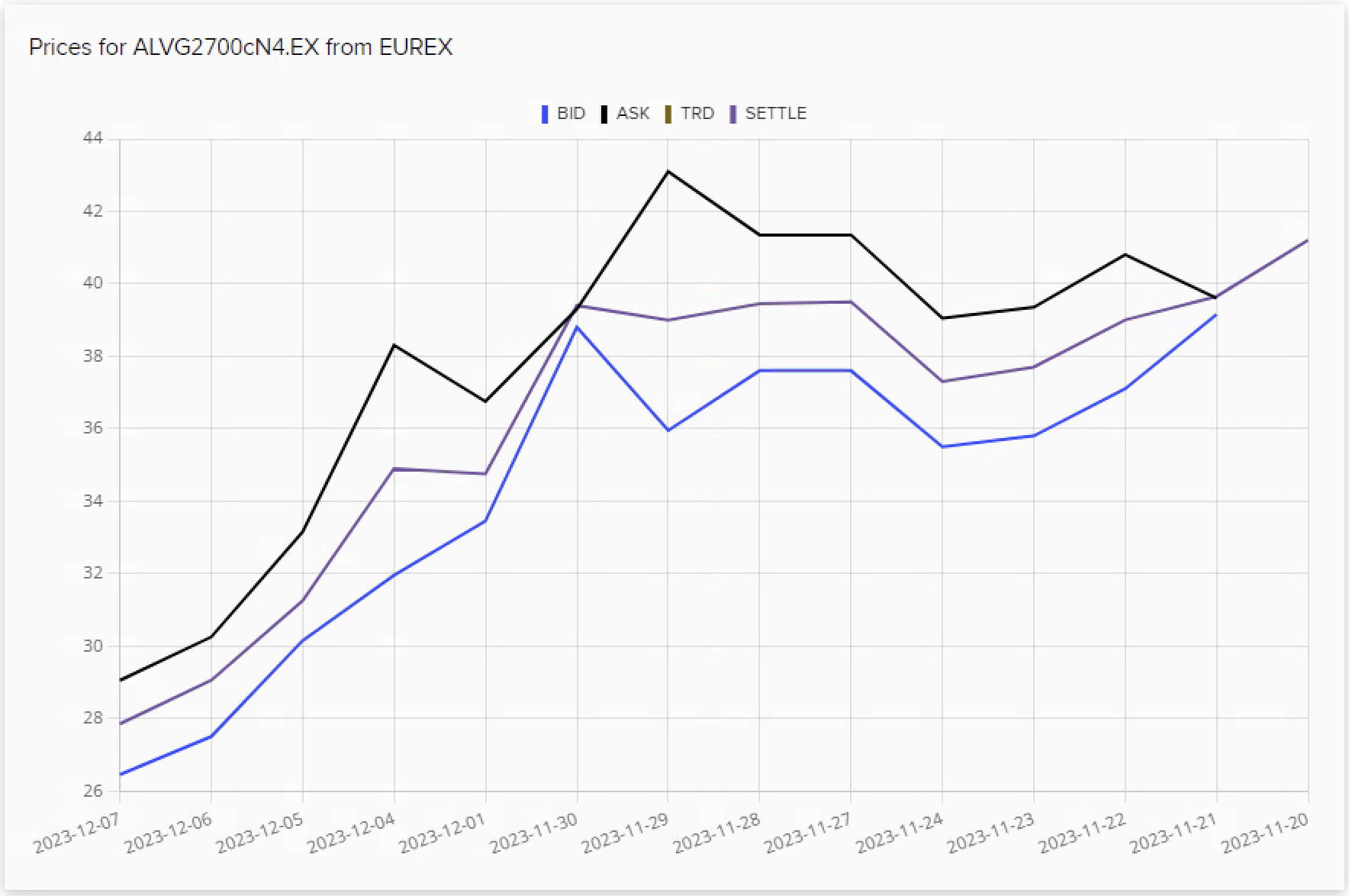
Show Prices chart
As mentioned above the pricing chart is triggered by "display-all-fields" icon, which initiates onClick operation by calling a dynamic URL using data from the DataTable row. This further calls ShowPrices function which orchestrates the retrieval of dynamic data based on URL parameters, updates the state accordingly, and visualizes the information in a structured manner using LSEG UI Elements.
export default function ShowPrices() {
const [data, setData] = React.useState([]);
const params = useParams()
React.useEffect(() => {
(async () => {
let res = await fetch(`http://local host:4000/findingRICs/pricesChart/${params.id}`);
if (res.ok) {
res = await res.json()
setData(res as any)
}
createPriceChart(res);
})()
}, [params.id]);
return (
<div className='chartContainer'>
<ef-card header={`Prices for ${data['ric']} from ${data['exchange']}`} class='lineChart' >
<ef-chart id="line"></ef-chart>
</ef-card>
</div >
)
}
As the code above suggests, we use ef-chart with an id “line” component from the Element Framework to renders the pricing chart for the specified instrument. Please refer to our documentation for more chart type and customizations.
Below is an example chart from the sample application:
Conclusion
This article has guided us through the construction of a React application integrated with UI Elements. We demonstrated the implementation of a form utilizing UI Elements such as text fields, date pickers, and dropdowns. We explored how to handle user input, communicate with the backend API, and dynamically render dialogue boxes based on construction results.
We also showcased the functionality to manage and display constructed RICs using the DataTable component. This component provided a structured view of the data, enriched with interactive elements such as action icons and clickable links, rendering pricing charts and opening Workspace applications. Finally, we briefly touched upon components of the Workspace SDK, setting the stage for future exploration of advanced features within the Workspace SDK.
References
For further details, please check out the following resources:
- Refinitiv Data Library for Typescript
- Element Framework
- Workspace SDK
- TypeScript programming language: Documentation.
- Developer Article: Functions to find Option RICs traded on different exchanges
For any questions related to this article or the used APIs, please use the Developer Community Q&A Forum.
- Register or Log in to applaud this article
- Let the author know how much this article helped you