Introduction
In this article, we are going to ingest time-series data using the Refinitiv Data Library and perform exploratory data analysis using the beta version of PyCaret, a “low-code” library that can be used to significantly decrease research and experimentation time. This can be done through various built-in tools that can very quickly provide important insight on the datasets.
Refinitiv Data Library
The Refinitiv Data Library for Python provides a set of easy-to-use interfaces offering our clients uniform programmatic access to the breadth and depth of financial data and services available on the Refinitiv Data Platform. The platform consists of data service layers that can provide streaming and non-streaming content as well as bulk content and a lot more, serving different client types from the desktop user to an enterprise application. Using the Refinitiv Data Library, the same Python code can be used to retrieve data regardless of which access point you choose to connect to the platform.
PyCaret
PyCaret is an open-source, low-code machine learning library in Python that can automate machine learning workflows. It is an end-to-end machine learning and model management tool that speeds up the experiment cycle exponentially therefore making data science teams more productive. It is essentially a Python wrapper around several machine learning libraries and frameworks such as scikit-learn, XGBoost, LightGBM, CatBoost, spaCy, Optuna, Hyperopt, Ray, and more. Pycaret recently released a Time Series Module which comes with a lot of handy features that can make time series modelling a breeze.
Pre-requisites
To run the example in this article we will need:
- Credentials for Refinitiv Data.
- The Anaconda distribution.
- A Python 3.7.* environment for full PyCaret compatibility.
- Required Python Packages: refinitiv-data, pycaret-ts-alpha & pandas
Environment Setup
If you don't have pycaret-ts-alpha already installed, please follow the below steps to install it in a separate python 3.7 environment so that it doesn't affect your existing package dependencies:
- Open a terminal
- Create a new conda environment with Python 3.7.* version conda create --name p_37 python=3.7 jupyter
- Activate the newly created conda environment conda activate p_37
- Install the required packages using pip pip install --user pycaret-ts-alpha mlflow refinitiv-data
- Start the Jupyter Notebook by running jupyter notebook
This will start your jupyter notebook in the newly created p_37 conda environment with all the required packages installed.
Load Packages
Now, lets import the packages we need for this example:
import warnings
warnings.filterwarnings('ignore')
import pandas as pd
import refinitiv.data as rd
from pycaret.time_series import TSForecastingExperiment
from os.path import exists
if not exists('../data/goog.csv'):
rd.open_session(app_key='')
df = rd.get_history(universe=["GOOG.O"], fields=['TR.PriceClose'], interval="1D", start="2014-01-01", end="2022-05-12")
rd.close_session()
df.to_csv('../data/goog.csv', index=True)
else:
df = pd.read_csv('../data/goog.csv', index=True)
Exploratory Data Analysis
Data preprocessing
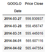
In order to perform time series analysis, PyCaret expects to see the data in a particular format. More specifically the dataframe that holds the data needs to contain the time series in a float column and the index needs to contain the timestamps in what is known as a PeriodIndex format. The script bellow does exactly that preparing the data for pycaret ingestion.
df.index = pd.PeriodIndex(df.index, freq='D')
df['Price Close'] = df['Price Close'].astype(float)
df.sort_index(ascending=True, inplace=True)
df.head()
Experiment Setup using Pycaret's TSForecastingExperiment
Now, let's initialize the modelling environment by setting up a few parameters. We will be setting the forecast horizon to predict the values for next 30 days and the number of folds for cross validation to test the models. We also inform pycaret that our main renderer is a jupyter notebook. We then instantiate a TSForecastingExperiment and initialise the newly created instance using the pre-defined parameters.
fig_kwargs={'renderer': 'notebook'}
forecast_horizon = 30
fold = 3
eda = TSForecastingExperiment()
eda.setup(data=df, fh=forecast_horizon, seasonal_period= [1, 5, 10, 20], fig_kwargs=fig_kwargs)
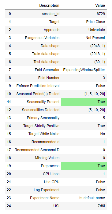
Already just by instantiating the model we have some very useful information at hand:
Our data has 2048 data points and PyCaret kept the last 30 as a test set for forecasting. The remaining 2018 data points will be used for training.
We asked PyCaret to check for possible seasonality in the data using 1, 5, 10 and 20 days options, and after testing it is reporting a primary seasonality of 5 days. We can also see that there is a lower probability of seasonality existence at 10 and 20 days.
Plot data using plot_model function
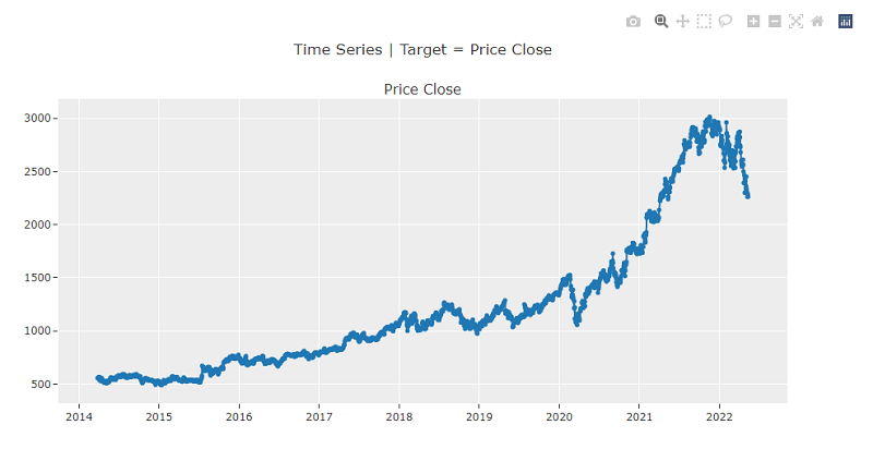
Another way of plotting the original data is by using plot_model. It's an interactive plot, allowing us to select a particular area on the graph and expand further at a more granular level than what we can initially see in the plot.
eda.plot_model()
Auto-Correlation Function & Partial Auto-Correlation Function Plots
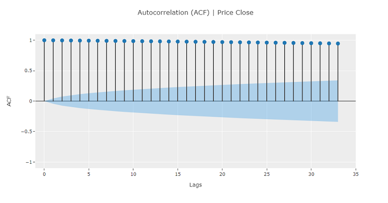
As this is a very important aspect of time series analysis, let's first explore the standard Auto-Correlation Function (ACF) and PACF plots of the dataset. The ACF is a time domain measure of the correlation between two datapoints and how that changes as the distance between them increases. If in a time series there is no correlation of the signal with itself in time then autocorrelation remains zero, such would be the case with white noise. Let's plot ACF for the Price close time series, pycaret will also provide a confidence band cone. The default is 95% confidence bands and essentially we can say that points that fall outside of the band impose an impact with a probability of more than 95%.
eda.plot_model(plot="acf")
The results do make sense, as we expect today's price close will indeed affect future prices, however we do not see any clear cycles in the time series.
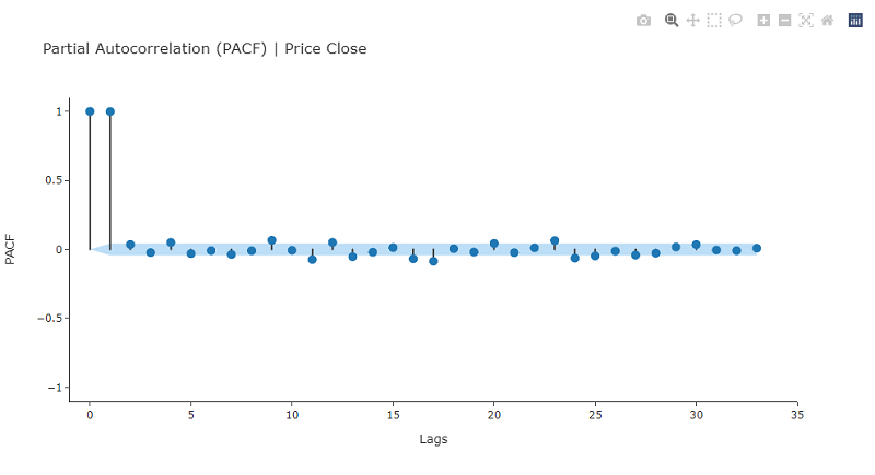
The PAC is a conditional correlation between two datapoints assuming that we know their dependencies with some other set of datapoints. In a time series essentially it describes the correlation between points t and t+n conditional on the time series values between them. We can customize the plot using kwargs, for example by using nlags we can determine the number of lags to examine.
eda.plot_model(
plot="pacf",
data_kwargs={'nlags':30},
fig_kwargs={'fig_size': [800, 500], 'template': 'simple_white'}
)
We can see from the above diagram that only the 1st and 2nd lagged values have a clear statistical significance with regards to their partial auto-correlations.
Periodogram
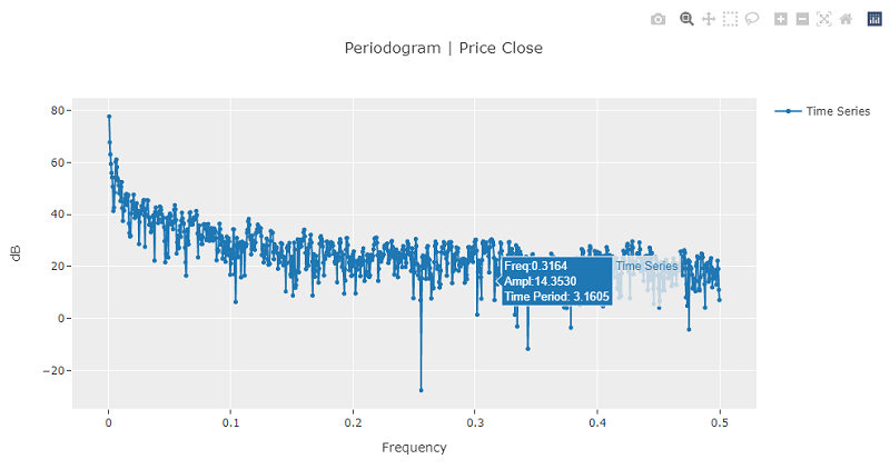
A periodogram can be used to identify the dominant constituent frequencies within a time series. The periodogram can provide insight regarding possible cyclical behavior in a series. The algorithm generating the plot will try to recompose the time series using a sum of cosine waves with varying amplitudes and frequencies. In the following periodogram we can see that, as expected in financial data, the time series is decomposed into many equal, on average, amplitude and close frequency cosine waves.
eda.plot_model(plot="periodogram")
Fourier Transform
Another interesting tool provided by PyCaret, useful for studying time series frequency components is the Fast Fourier Transform.
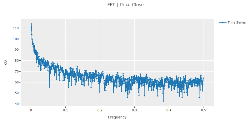
A high value at a frequency close to zero can indicate the existence of a wandering random walk component within the time series. In such a case it usually recommended to differentiate the series to neutralise it. This could also be indicative of a stationary ARMA process with a high positive phi value.
Furthermore, periodic value peaks at a frequency and its multiples is indicative of seasonality existence. The lowest or base frequency in this case is called the fundamental frequency and its inverse is the seasonal period for the model.
eda.plot_model(plot="fft")
In this plot we can see FFT is peaking at f ~= 0, indicating that we could benefit from differencing the data.
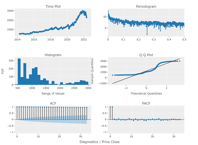
PyCaret also provides a very handy way of plotting all these graphs in a single multi-plot by using the diagnostics plot.
eda.plot_model(plot="diagnostics", fig_kwargs={"height": 800, "width": 1000})
Two more interesting plots are added in the collection using this call. The Probability Density Function plot and the Q-Q plot. The first one reveals the distribution of frequency of closing prices and the second one how linear the data is. We can see from the second plot the data is highly non-linear.
Time series decomposition
Time series decomposition is the process of reducing a time series into its four structural components. These are:
Trend: The general direction to which the time series is moving. Seasonality: Repeating signal cycles within the time series. Level: The average value of the time series. Noise: Random components within the series.
Classical Decomposition
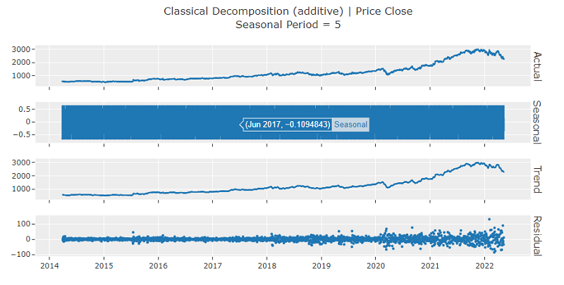
The default setup with regards to seasonality is the period detected during PyCaret initialisation which would be 5 in this case. We can use the 'decomp' plot parameter to request the specific graphs.
eda.plot_model(plot="decomp")
By using the data_kwargs dictionary parameter we can pass specific parameters to the call to affect its default behaviour. We can for example change the seasonality period to explore other possible underlying components within the time series.
eda.plot_model(plot="decomp", data_kwargs={'seasonal_period': 20})
The PyCaret plot_model function allows for a lot of customisation and different possible uses that can provide different insight into the time series we are trying to analyse. Amongst others, we can customize the decomposition plot for multiplicative seasonality or use Loess, a versatile and robust method for decomposing time series that can estimate nonlinear relationships.
Statistical tests
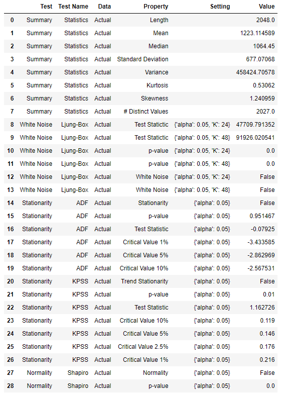
Statistical testing is another important part of time series modelling. In pycaret we can use the check_stats function and provide any of these options:
- summary: Summary Statistics
- white_noise
- stationarity: Stationarity tests (ADF and KPSS)
- adf: Stationarity tests (ADF)
- kpss: Stationarity tests (KPSS)
- normality
- all
This will allow us to retrieve a multitude of results that correspond to each of the options. Aside from the default behaviour, we also have the option to customise the tests.
eda.check_stats()
Conclusion
This article aims at providing the foundations for using the RD library and PyCaret. We explored environment setup and ingested the time series data using Refinitiv Data library. Furthermore, we performed exploratory data analysis using the different kinds of plots and statistical tests provided from PyCaret.

