
ABOUT THE MODEL
This python model can be used as a charting utility for a portfolio of bonds. The user is expected to feed a list of RICs into the main function get_data() and the module will build yield curves on the supplied portfolio automatically. Similar to other notebooks described in this article, this file is designed to be imported as a module into other jupyter notebooks using the ipynb python library and used by calling the main calculation function:
ymap_charting.get_data(ric_list, width = 15, height = 15, enable_fitting = True)
The only input expected from the user is the instrument list (ric_list) containing RICs. The chart width, height and curve fitting parameters are optional. The function returns a matplotlib chart.
To make the navigation in this article easier, please use this index to skip to the relevant section:
- Yield Map charting logic
- Bond metadata retrieval with Eikon Data API
- Curve fitting with NSS overview
- Chart label placement and anti-ovelap handler
YIELD MAP CHARTING LOGIC
DEPENDENCIES AND VARIABLES
In addition to Eikon Data API, Pandas, Numpy and Matplotlib, this model relies heavily on 2 more Jupyter notebooks, which are imported using the ipynb library. We will be describing them in this article as well:
| bond_metadata.ipynb | Retrieves all necessary metadata and market quotes on bonds. |
| curve_fitting.ipynb | Returns a fitted curve on a given set of data points. |
The imports and variable declarations are done as follows:
import eikon as ek
import pandas as pd
import numpy as np
import matplotlib
import matplotlib.pyplot as plt
import ipynb.fs.full.bond_metadata as bond
import ipynb.fs.full.curve_fitting as curve
from datetime import datetime
import warnings
warnings.filterwarnings('ignore')
matplotlib.use('Agg')
app_key = 'YOUR_APP_KEY'
ek.set_app_key(app_key)
_labelAlignmentArray = [1, 2, 4, 8, 16, 32, 64, 128]
_minMovingDistance = 1
_maxMovingDistance = 3
clrs = ['blue', 'orange', 'red', 'green', 'black', 'purple', 'brown', 'yellow', 'gray', 'darkgreen', 'darkblue', 'darkred']
_chart_area = {}
curves = {}
sizeMarker = pd.DataFrame()
Importing other Jupyter notebooks via ipynb.fs.full.XXXX is similar to importing .py files into your script, but if we wanted to import just functions or classes, rather than the whole script, we could limit the expression to ipynb.fs.defs.XXXX.
The global variables _labelAlignmentArray, _minMovingDistance, _maxMovingDistance and _chart_area are all used later in the label placement algorithm for the chart.
FUNCTION DEFINITIONS
This Jupyter notebook contains the following functions:
| get_data() | The main function that consumes the user's bond portfolio as input and produces a matplotlib chart. |
| _moveUp() | Moves a data point's annotation up. |
| _moveDown() | Moves a data point's annotation down. |
| _moveRight() | Moves a data point's annotation to the right. |
| _moveLeft() | Moves a data point's annotation to the left. |
| calculatePosition() | Calculates the position of a point's annotation relative to the marker and changes the position based on the discete step algorithm. |
| place_labels() | The main function that is called to perform label placement and ensure that the annotations do not overlap. |
| isLabelCollide() | This function that checks if a given data label overlaps with other chart items: label callout lines, markers and other annotations. |
| isIntersect() | This is a wrapper function for intersect(). |
| intersect() | This auxilary finction performs a mathemetical calculation to determine if 2 lines on the chart are intersecting. |
| isOverlap() | An auxilary funtion that determines if 2 chart items (label or marker) are overlapping. |
| name_builder() | Creates the string values for the scatter point annotations from various bond metadata items. |
| perp_check() | Checks if the given bond is perpetual and reflects that in the annotation. |
Let's have a step-by-tep walk through the main function.
RUNNING THE MODEL
When we feed a portfolio list into the get_data() function, the script does a series of declarations first and retrieves the metadata on the given bonds:
def get_data(rics, width = 15, height = 15, enable_fitting = True, debug=False, save_image = False):
global _chart_area
global sizeMarker
global curves
fit = curve.create
get_data = bond.get_data
metadata = get_data(rics, '')
metadata = metadata.sort_values(by = ['tenor'])
metadata = metadata.reset_index(drop = True)
metadata['name'] = name_builder(metadata)
. . .
Once the metadata is retrieved, we sort all values by tenor - which will help us later, when we will be building the yield curves. And The name_builder() functon is called to create the annotations for each bond in the portfolio following this structure: [issuer ticker] + [coupon rate] + [year of maturity] + [currency of denomination].
We then proceed to creating the yield curves. The first step is to identify suitable bonds, that can be used to construct the issuer curves. We do that by creating a list of unique issuer PermIDs from the bond metadata dataframe:
. . .
pids = list(metadata['issuer_permid'].unique())
b_dict = {}
c_dict = {}
crvobj = {}
legend = {}
. . .
Now that we have all the issuers in our portfolio we will create a dictionary of the constituents that will be used in the curves:
. . .
for i in pids:
b_dict[i] = metadata.loc[(metadata['issuer_permid'] == i) & (metadata['bond_type'] == 'FRB') & ((metadata['seniority'] == 'UN') | (metadata['seniority'] == 'SR')) & (metadata['callable'] != 'Y') & (metadata['putable'] != 'Y') & (metadata['sinkable'] != 'Y')]
b_dict[i] = b_dict[i].reset_index(drop = True)
if len(b_dict[i]) > 2:
c_dict[i] = [b_dict[i]['tenor'], b_dict[i]['yield']]
if enable_fitting:
crvobj[i] = fit(list(c_dict[i][0]), list(c_dict[i][1]), max(list(c_dict[i][0])))
else:
crvobj[i] = [list(c_dict[i][0]), list(c_dict[i][1])]
legend[i] = str(b_dict[i]['description'][0]).split(' ')[0]+' curve'
curves = b_dict
. . .
The snippet above applies the following filters to the original metadata:
- the curves will be built from fixed coupon bonds, hence 'bond_type' = 'FRB';
- all issues are to be of a senior tranche and have no collateral: 'seniority' = 'UN' or 'SR';
- since we are interested only in vanilla instruments, there should be no embedded options or sinking fund provision: 'callable', 'putable' and 'sinkable' flags should exclude 'Y'.
As we cycle through each issuer in the portfolio, any entity that has more than 2 bonds matching our criteria is then used to build a yield curve object with or without fitting. Should the user choose the enable_fitting = False, there will be no call to the cuve_fitting.ipynb, so the chart will contain a curve with linear interpolation instead.
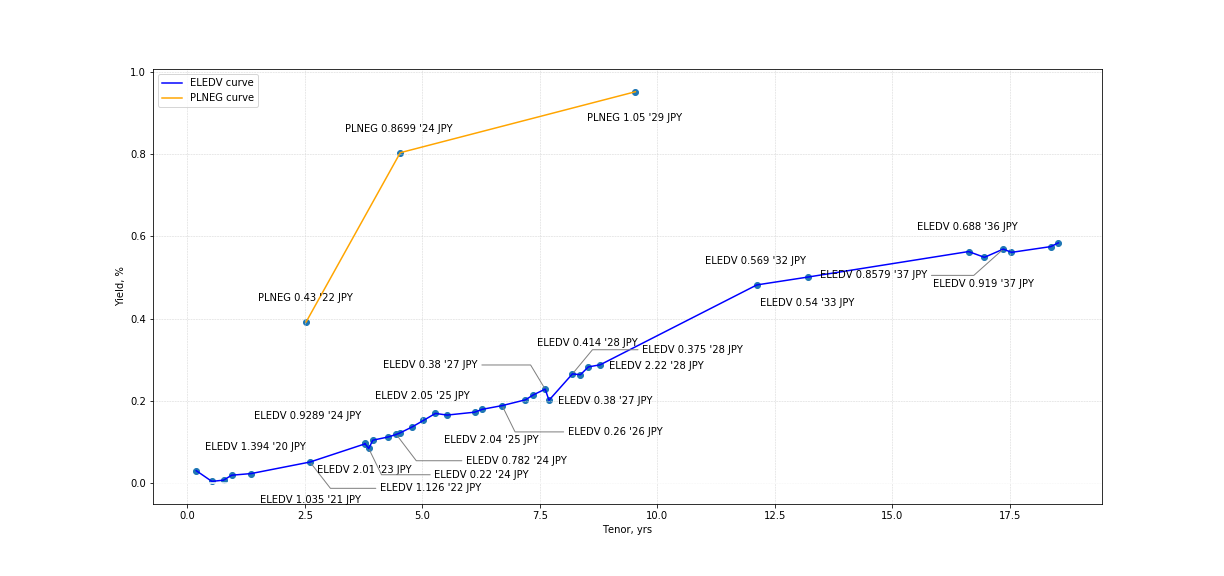
The remainder of this function is focused just on the chart and handling annotation placement, which is described in detail in the final section of this article, as it could be a subject for a separate article. Nevertheless, once get_data() function comletes the operations with matplotlib, we will get a chart. Below are a few examples of charts with / without curve fitting.
In [2]:
%matplotlib inline
jp_electric_port = [
'JP00309513=','JP00319513=','JP00329513=','JP00339513=','JP00379513=','JP10010524=',
'JP00359513=','JP00039513=','JP00389513=','JP00469513=','JP00399513=','JP00409513=',
'JP00419513=','JP00059513=','JP10020524=','JP00089513=','JP00119513=','JP00139513=',
'JP00159513=','JP00429513=','JP00439513=','JP00459513=','JP00499513=','JP00509513=',
'JP00539513=','JP00549513=','JP00559513=','JP00579513=','JP00599513=','JP00269513=',
'JP10040524=','JP00489513=','JP00569513=','JP00449513=','JP00479513=','JP00519513=',
'JP00529513=','JP00589513=','JP00609513=']
get_data(jp_electric_port, height = 8, width = 17, enable_fitting = False)
Out [2]:
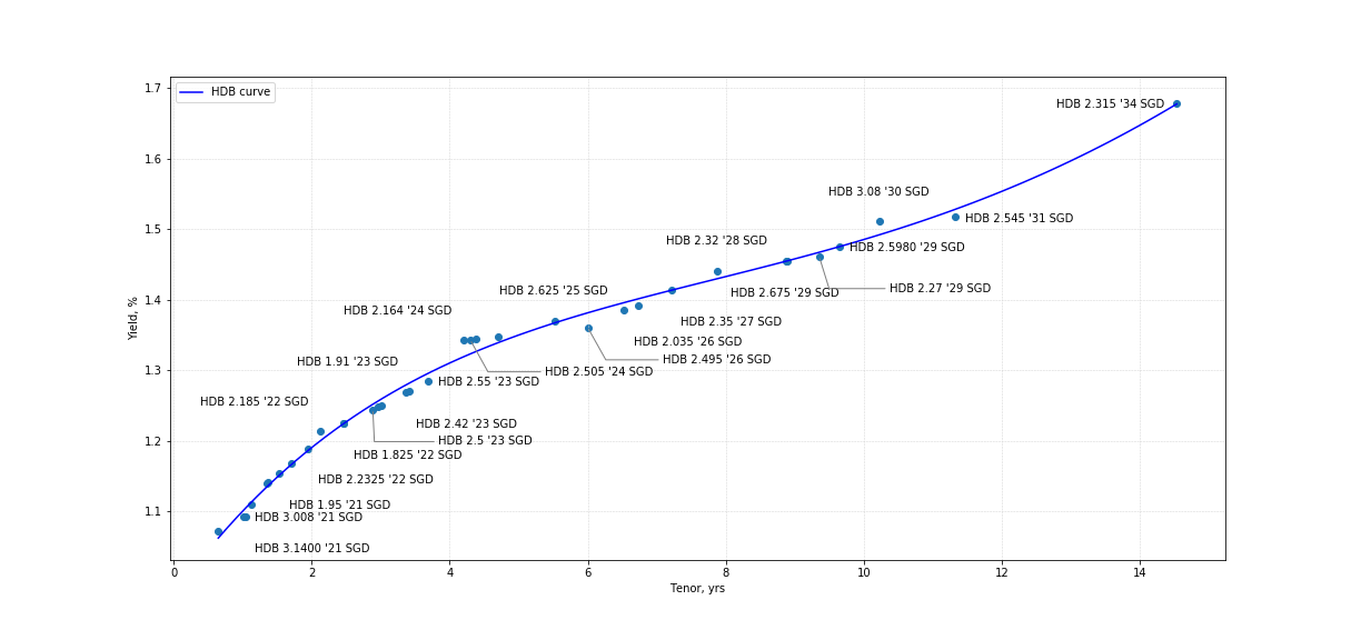
In [3]:
%matplotlib inline
hdb_port = ['SGHDB1226=','SGHDB1124=','SGHDB1123=','SGHDB1121=','SGHDB1120=','SGHDB1029=','SGHDB0934=',
'SGHDB0926=','SGHDB0925=','SGHDB0921=','SGHDB0823=','SGHDB0822A=','SGHDB0822=','SGHDB0731=',
'SGHDB0729=','SGHDB0724=','SGHDB0723=','SGHDB0721A=','SGHDB0721=','SGHDB0624=','SGHDB0530=',
'SGHDB0527=','SGHDB0524=','SGHDB0422=','SGHDB0421=','SGHDB0326=','SGHDB0323=','SGHDB0321A=',
'SGHDB0321=','SGHDB0223=','SGHDB0222=','SGHDB0129A=','SGHDB0129=','SGHDB0128=','SGHDB0123=']
get_data(hdb_port, height = 8, width = 17, enable_fitting = True)
Out [3}:
Let's now have a look at the auxilary modules in more detail.
BOND METADATA RETRIEVAL WITH EIKON DATA API
This Jupyter notebook contains 2 functions:
- get_data() - the main function which is designed to retreive and organize the data nicely into a pandas dataframe; it is the script described in the first section;
- get_bond_type() - this auxilary function generalizes the bond type to such categories like fixed rate bond (FRB), floating rate note (FRN) and inflation-linked bond (ILB).
The script is initiated with importing the following dependencies:
import eikon as ek
from datetime import datetime, timedelta
import pandas as pd
import numpy as np
app_key = 'YOUR_APP_KEY'
ek.set_app_key(app_key)
cpn_dict = {'FXAN':'FRB', 'FXDI':'FRB', 'FXPP':'FRB', 'FXPM':'FRB', 'FXMF':'FRB', 'FXZC':'FRB', 'FXPV':'FRB', 'FRBF':'FRN', 'FRPV':'FRN', 'FRFF':'FRN', 'FXRV':'FRN', 'FROT':'FRN', 'FRFX':'FRN', 'FRVR':'FRN', 'FRFZ':'FRN', 'FRPM':'FRN', 'FRSD':'FRN', 'FRSU':'FRN', 'VRFR':'FRN', 'FRZF':'FRN', 'RGOT':'FRB', 'TBPD':'FRN', 'FTZR':'FRB', 'VRGR':'FRB', 'ZRFX':'FRB', 'ZRVR':'FRB'}
The cpn_dict contains the mapping of various coupon types to the generalized bond description, which is handled by get_bond_type():
def get_bond_type(is_ilb, cpn):
inst_type = []
for x in range(len(is_ilb)):
if is_ilb[x].strip() == 'Y':
inst_type.append('ILB')
else:
inst_type.append(cpn_dict[cpn[x]])
return inst_type
Note, that this function will always mark a bond as an ILB irrespectively of whether the coupon type is fixed, floating or variable, and the reason for this was to potentially apply different calculation approaches if needed (in case this module is used with other python notebooks).
The get_data() function, is initialized by passing the list of RICs as a main parameter:
def get_data(codes, at_date = ''):
today_date = datetime.strptime(datetime.today().strftime('%Y-%m-%d'), '%Y-%m-%d')
at_date = datetime.strptime(at_date, '%Y-%m-%d') if at_date != '' else ''
realtime = True if (today_date == at_date or at_date == '') else False
output = []
crv = pd.DataFrame()
. . .
We obtain todays' date to calculate the bond tenors, and we create an empty pandas dataframe, which will store different metadata fields.
Next we retrieve the bond data with Eikon Data API - the field list is hardcoded as can be seen in the snippet below:
. . .
raw,err = ek.get_data(codes,['PRIMACT_1', 'SEC_ACT_1', 'RT_YIELD_1', 'SEC_YLD_1', 'PRC_QL3', 'TR.FiMaturityDate', 'TR.ADF_BONDSTRUCTURE', 'TR.ADF_RATESTRUCTURE', 'TR.ADF_STRUCTURE', 'TR.FiCouponRate', 'TR.FiCurrency', 'TR.FiDescription', 'TR.FiInflationProtected', 'TR.FiCouponType', 'TR.ADF_MARGIN', 'TR.FiSeniorityType', 'TR.FiIsBenchmark', 'TR.UltimateParentId', 'TR.FiIsPutable', 'TR.FiIsCallable', 'TR.FiIsSinkable', 'TR.FiIsPerpetualSecurity', 'TR.FiNextCallDate'])
raw = raw.dropna(how = 'all', subset = ['PRIMACT_1', 'SEC_ACT_1', 'RT_YIELD_1', 'SEC_YLD_1'])
raw = raw.reset_index(drop=True)
crv['ric'] = raw['Instrument']
tmp_ric = raw['Instrument'].values.tolist()
isin = ek.get_symbology(tmp_ric, from_symbol_type='RIC', to_symbol_type='ISIN')
crv['isin'] = isin['ISIN'].values.tolist()
crv['maturity'] = raw['Maturity Date']
crv['coupon'] = raw['Coupon Rate'] / 100
crv['currency'] = raw['Currency']
crv['bond_structure'] = raw['Bond Structure']
crv['rate_structure'] = raw['Rate Structure']
crv['structure'] = raw['Structure']
crv['description'] = raw['Description']
crv['seniority'] = raw['Seniority Type']
crv['putable'] = raw['Is Putable']
crv['callable'] = raw['Is Callable']
crv['sinkable'] = raw['Is Sinkable']
crv['bond_type'] = get_bond_type(raw['Inflation Protected'].values.tolist(), raw['Coupon Type'].values.tolist())
crv['quoted_margin'] = raw['FRN Margin'] / 100
crv['quotation_method'] = raw['PRC_QL3']
crv['issuer_permid'] = raw['Ultimate Parent Id']
crv['is_benchmark'] = raw['Is Benchmark']
crv['is_perpetual'] = raw['Is Perpetual Security']
crv['call_date'] = raw['Call Date']
. . .
After the data retrieval is complete, we substitute the default column headers with custom ones as can be seen above. And lastly, it is possible to modify this script to work with historical data, and perform not only price / yield retrieval, but also underlying treasury ISIN at date for constant maturity benchmanks - all of this is possible today, and can be implemented in this script. The function exists with the following mapping:
. . .
if realtime:
crv['bid_yield'] = raw['RT_YIELD_1']/100
crv['ask_yield'] = raw['SEC_YLD_1']/100
crv['yield'] = crv['bid_yield']
crv['tenor'] = (pd.to_datetime(crv['maturity'], format = '%Y-%m-%d') - datetime.now()) / np.timedelta64(1,'D')
for i, p in enumerate(crv['is_perpetual']):
if p == 'Y':
try:
crv['tenor'][i] = (pd.to_datetime(crv['call_date'][i], format = '%Y-%m-%d') - datetime.now()) / np.timedelta64(1,'D')
except:
pass
crv['tenor'] = crv['tenor'] / 365
crv['bid'] = raw['PRIMACT_1'] / 100
crv['ask'] = raw['SEC_ACT_1'] / 100
return crv
CURVE FITTING WITH NSS OVERVIEW
BACKGROUND
The curve fitting is handled by the curve_fitting.ipynb Jupyter notebook. The primary method implemented here is the Nelson-Siegel-Svensson (NSS) approach. The formula for NSS is given as:
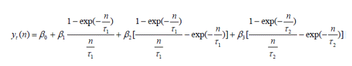
The parameters β0 and β1 determine the yield curve's level and slope, whereas β2 and β3 add humps to the curve's twist on the longer end at tenors τ1 and τ2. This is a modification of the original Nelson-Siegel curve model, which was extended by Svensson to ensure that the curve retains the convexity for longer tenors - a problem, that can sometimes be encountered with splines, where the convexity tends to pull the yields down. The model utilizes maximum likelihood to estimate the parameters and achieve a minimized sum of squares.
PYTHON IMPLEMENTATION
The model initializes with importing the following libraries:
from numba import jit
import numpy as np
from numpy import *
from scipy.optimize import curve_fit, fmin
import scipy.special as sp
We will be using a just-in-time compiler to speed up the performance, especially if this model will need to be used with real-time streaming calculation should you wish to call it from other Jupyter notebooks and scripts, hence we use the @jit decorator with some functions.
@jit(nopython=True)
def nss_curve(x, b1, b2, b3, b4, l1, l2):
tl1 = x/l1
tl2 = x/l2
etl1 = exp(-tl1)
etl2 = exp(-tl2)
metl1 = (1 - etl1) / tl1
metl2 = (1 - etl2) / tl2
nss = b1 + b2 * metl1 + b3 * (metl1 - etl1) + b4 * (metl2 - etl2)
return nss
Above is the python representation of the NSS formula. This auxilary function is called from the NSS parameters solver, which is implemented with scipy:
def get_nss_params(x, y):
nss_lim_lower = [0,-np.inf,-np.inf,-np.inf,0.0001,0.0001]
nss_lim_upper = [np.inf,np.inf,np.inf,np.inf,np.inf,np.inf]
nss_var = curve_fit(nss_curve,x,y, bounds=(nss_lim_lower,nss_lim_upper), method='trf')[0]
return nss_var
The parameters are obtained using the non-linear least squares with the stated boundaries. There can be cases, when the optimizer fails to obtain a solution, hence a second auxilary method is introduced, which relies on the scipy.optimize.fmin that uses a downhill simplex algorithm. The function handling this calculation is get_nss_adv():
def get_nss_adv(x2, y2):
x = array(x2)
y = array(y2)
fp = lambda c, x: (c[0])+ (c[1]*((1- exp(-x/c[4]))/(x/c[4])))+ (c[2]*((((1-exp(-x/c[4]))/(x/c[4])))- (exp(-x/c[4]))))+ (c[3]*((((1-exp(-x/c[5]))/(x/c[5])))- (exp(-x/c[5]))))
# error function to minimize
e = lambda p, x, y: ((fp(p,x)-y)**2).sum()
# fitting the data with fmin
p0 = array([0.01,0.01,0.01,0.01,0.01,1.00,1.00]) # initial parameter value
res = fmin(e, p0, args=(x,y), disp=False)
return res
And finally - the main function, which is used to calculate the NSS approximation is create():
def create(tenors, yields, new_issue_tenor):
x = tenors
y = yields
x2 = []
y2 = []
x_max = x[-1]
try:
nss_params = get_nss_params(x, y)
except:
nss_params = get_nss_adv(x, y)
nss_params = np.delete(nss_params, -1)
nss_crv_x = np.linspace(x[0], x_max, 100)
nss_crv_y = nss_curve(nss_crv_x,*nss_params)
log_crv_func = np.poly1d(np.polyfit(log(x), y, 1))
log_crv_x = nss_crv_x
log_crv_y = log_crv_func(log_crv_x)
nss_accuracy = get_regression_quality(nss_crv_x, nss_crv_y, x, y)
log_accuracy = get_regression_quality(log_crv_x, log_crv_y, x, y)
if nss_accuracy > log_accuracy:
nss_crv_y = log_crv_y
if x_max < new_issue_tenor and new_issue_tenor != '':
x_min = nss_crv_x[90]
for i in range(10):
x2.append(nss_crv_x[90+i])
y2.append(nss_crv_y[90+i])
p = np.poly1d(np.polyfit(x2, y2, 3))
crv_x2 = np.linspace(x2[-1]+0.01, new_issue_tenor, 50)
crv_y2 = p(crv_x2)
nss_crv_x = np.concatenate((nss_crv_x, crv_x2), axis = None)
nss_crv_y = np.concatenate((nss_crv_y, crv_y2), axis = None)
return [nss_crv_x, nss_crv_y]
The function uses a list of tenors and yields of the bond datapoints, to fit the NSS curve. Given the previous description of the auxilary functions, the given script is quite straight forward, as it posts calls to the aforementioned methods following these steps:
- calculate NSS fitting parameters from the input market data;
- generate an array of evenly spaced numbers (in our case 100 data points) with numpy.linspace, which will be used a s series of x-values for our NSS function;
- get a series of y-values (i.e. yields) for every point in the linspace array;
- assess the regression's quality using the least squares method and compare it to a simple logarithmic regression, which can be used in case the NSS fitting is of poor quality.
The remaining section dealing with new issue tenors and extrapolating the curve to match a tenor that falls beyond the given x-values is a snippet, that can be used by other python models, which need to extrapolate a fitted curve to a custom x-value. This is not required in our case for the ymap_charts.ipynb.
The function returns a list of numpy arrays containing the x and y coordinates of the fitted curve, which will be displayed with matplotlib in the main module.
CHART LABEL PLACEMENT AND ANTI-OVERLAP HANDLER
Now that we described the data retrieval and curve building process, let's cover the final bit of the model - charting. In the section describing the get_data() function, we left of at the point, where the script created a dictionary of fitted yield curves. From that part onward get_data() focuses only on creating a scatter plot and label placement with matpolitlib.
Our first step is to ceate a pyplot figure as follows:
. . .
fig, ax = plt.subplots()
fig.set_figwidth(width)
fig.set_figheight(height)
plt.scatter(list(metadata['tenor']), list(metadata['yield']*100))
for i, co in enumerate(crvobj.keys()):
plt.plot(list(crvobj[co][0]), list(np.multiply(crvobj[co][1], 100)), label=legend[co], color = clrs[i])
. . .
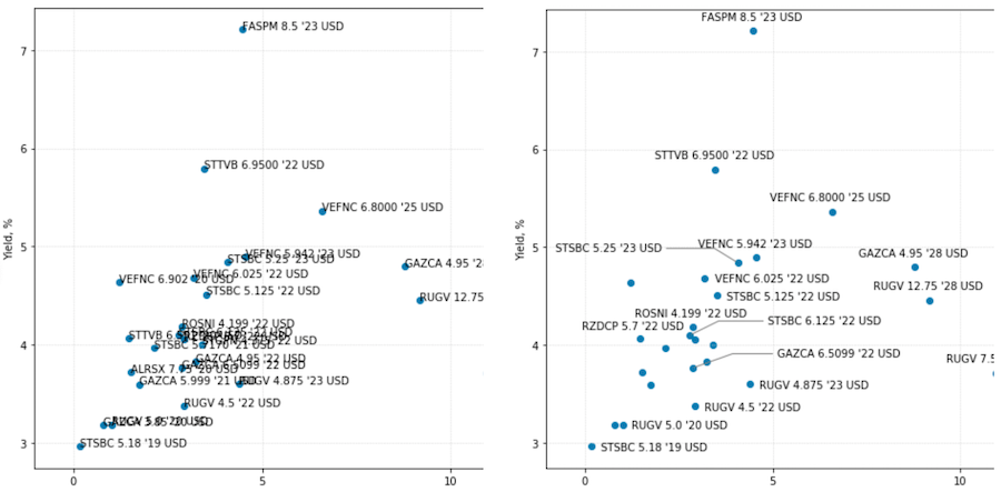
Once we have added the key items such as bonds and yield curves to the chart in the snippet above, we then move on to working with annotations. Usually adding labels to scatter plots is not a big deal, and we could easily set refer the list of bond names to the matplotlib chart and leave it as is, but the problem that we are trying to solve is a bit more complicated. What we would like to achieve is to make sure that the labels that overlap with one another would either be re-aligned next to the data points marker or hidden so that we could easily read the text on the plot. The image below illustrates the desired result:
Since matpotlib does not have any native way to manipulate the annotation coordinates, we will have to keep a list of all attributes ourselves:
. . .
xy = [list(metadata['tenor']), list(metadata['yield']*100)]
ymin, ymax = plt.ylim()
xmin, xmax = plt.xlim()
lbl = pd.DataFrame()
sizeMarker = pd.DataFrame()
lbl['text'] = metadata['name'].values.tolist()
lbl['x'] = 0.0
lbl['y'] = 0.0
lbl['alignment'] = 0
lbl['visible'] = True
lbl['x1'] = 0.0
lbl['x2'] = 0.0
lbl['y1'] = 0.0
lbl['y2'] = 0.0
lbl['width'] = 0.0
lbl['height'] = 0.0
lbl['line'] = False
lbl['step'] = 1
ann = []
x = []
y = []
x1 = []
x2 = []
y1 = []
y2 = []
w = []
h = []
plt.grid(color='lightgray' , linestyle='--', linewidth=0.5)
. . .
To start working with the coordinates of labels, we will create the pyplot canvas and get such data around the dimensions of the chart area, and convert the "display" coordinates of the scatter points to the chart's "data" coordinates:
. . .
for i in range(len(lbl)):
#get label dimensions
ann.append(ax.annotate(lbl['text'][i], (xy[0][i], xy[1][i]), xytext=(lbl['x'][i], lbl['y'][i]), textcoords='offset pixels'))
fig.canvas.draw()
#get sixeMarker dimensions (8 px to data coordinates)
cbox = ([[0, 0], [3, 3]])
marker_xy = ax.transData.inverted().transform(cbox)
sizeMarker['d'] = [(list(marker_xy[1])[0] - list(marker_xy[0])[0])]
sizeMarker['r'] = [(list(marker_xy[1])[0] - list(marker_xy[0])[0])/2]
for i in range(len(lbl)):
_ann = ann[i]
bbox = matplotlib.text.Text.get_window_extent(_ann)
tcbox = ax.transData.inverted().transform(bbox)
box = [list(tcbox[0]), list(tcbox[1])]
_w = (box[1][0] - box[0][0])*1.02
w.append(_w)
_h = (box[1][1] - box[0][1])*1.02
h.append(_h)
_ann.remove()
#set initial lable position
x.append(xy[0][i] - _w/2)
y.append(xy[1][i] - _h/2.5) #center and lower a bit
x1.append(x[i])
y1.append(y[i] + _h)
x2.append(x1[i] + _w)
y2.append(y[i])
. . .
The above loop goes through every data point and fetches the coordinates in to respective lists, where x1 is the left side of the annotation box, x2 is the right side, y1 - top, y2 - bottom. After this data is gathered, we store it in a dataframe, which will be used to keep track of the location of each annotation box throughout all manipulations:
. . .
lbl['x'] = x
lbl['y'] = y
lbl['x1'] = x1
lbl['x2'] = x2
lbl['y1'] = y1
lbl['y2'] = y2
lbl['width'] = w
lbl['height'] = h
_chart_area = {'bottom':ymin, 'left':xmin, 'top':ymax, 'right':xmax}
lbl = place_labels(lbl, xy)
. . .
The place_labels() function then takes all the collected data through a discrete step algorithm, which changes the position of each label in the following order:
In case the placement function does not find a suitable spot, the radius is then increased by 1 and we attempt to place the label farther from the original data points. If the placement will be done on radius 2-3, then the chart will display a connection line from the data point to the annotation.
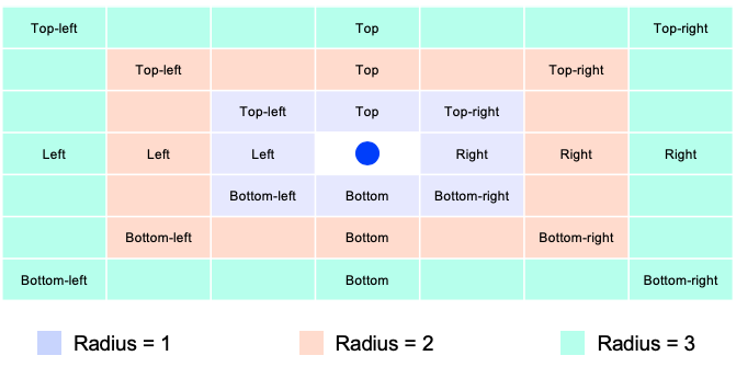
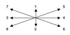
To summarize, the core principle of the method is to loop through predefined label alignments around a data point and increase the distance from the label to the data point in case it overlaps with its neighbour. If the labels still overlap, they will be hidden. In total every label can have up to 8 alignments x 3 radius increments = 24 positions as shown on the diagram above. The function call with the loop looks like this:
def place_labels(labels, xy):
x = labels['x'].values.tolist()
y = labels['y'].values.tolist()
x1 = labels['x1'].values.tolist()
x2 = labels['x2'].values.tolist()
y1 = labels['y1'].values.tolist()
y2 = labels['y2'].values.tolist()
w = labels['width'].values.tolist()
h = labels['height'].values.tolist()
v = labels['visible'].values.tolist()
a = labels['alignment'].values.tolist()
l = labels['line'].values.tolist()
s = labels['step'].values.tolist()
pt_x = xy[0]
pt_y = xy[1]
for i in range(len(pt_x)):
step = 1
min_r = _minMovingDistance
max_r = _maxMovingDistance
increment = 2
curr_r = 1
flag = True
while curr_r <= max_r and flag:
for align in _labelAlignmentArray:
s[i] = step
x[i], y[i], x1[i], x2[i], y1[i], y2[i], l[i], a[i] = calculatePosition(align, a[i], x[i], y[i], x1[i], x2[i], y1[i], y2[i], h[i], w[i], step)
if (not isLabelCollide(i, x, y, x1, x2, y1, y2, w, h, v, pt_x, pt_y)):
flag = False
break
curr_r += increment
step += 1
v[i] = not flag
. . .
The calculatePosition() method picks up the current label alignment and simply changes the x & y coordinates by adding / subtracting the defined increments to x1, x2, y1 and y2 using the radius multiplier. A lot of the operations are repetitive, so we will not expose the whole function here, but to provide the idea on the implementation, let's refer to the snippet below:
def calculatePosition(align_array, a, x, y, x1, x2, y1, y2, h, w, step):
d = sizeMarker['d'][0]
for i in range(step):
if align_array == 1: #top
if a == 128:
y = _moveUp(y, h, d)
y = _moveUp(y, h, d)
y1 = _moveUp(y1, h, d)
y1 = _moveUp(y1, h, d)
y2 = _moveUp(y2, h, d)
y2 = _moveUp(y2, h, d)
x = _moveRight(x, w, d)
x1 = _moveRight(x1, w, d)
x2 = _moveRight(x2, w, d)
a = 1
else:
y = _moveUp(y, h, d)
y1 = _moveUp(y1, h, d)
y2 = _moveUp(y2, h, d)
break
elif align_array == 2: #bottom
y = _moveDown(y, h, d)
y = _moveDown(y, h, d)
y1 = _moveDown(y1, h, d)
y1 = _moveDown(y1, h, d)
y2 = _moveDown(y2, h, d)
y2 = _moveDown(y2, h, d)
. . .
#do it for right / left / top-right / bottom-right / top-left / bottom-left.
. . .
a = align_array
l = step > 1
return x, y, x1, x2, y1, y2, l, a
This function also makes use of such auxilary functions like _moveUp, _moveDown, _moveRight and _moveLeft, which perform tasks listed at the beginning of this article. Each of them has a structure similar the following script:
def _moveUp(y, h, d):
y += d/1.75
y += h
return y
The adjustments are purely mathematial manupulations of the coordinate values.
The last 3 functions that we haven't covered, but that are used by the place_labels() method are isLabelCollide(), isIntersect() and isOverlap(). The isLabelCollide() function checkes if the labels overlap with one another or with callout lines and if they are shown beyond the chart's view port. It leverages the auxilary functions mentioned below.
The isOverlap() function simply compares whether 2 rectangle shapes (which correspond to the annotation boxes) that are compared to one another have any overlapping areas. This is done purely by comparing the x & y coordinates of each item in the script and returning a boolean value (i.e. True if the shapes overlap). This would then trigger another iterations with an updated label alignment as per the above diagram.
def isOverlap(first, second):
if not first[4] or not second[4]:
return False
x11 = first[0] #left
y11 = first[2] #top
x12 = first[1] #right
y12 = first[3] #bottom
x21 = second[0] #left
y21 = second[2] #top
x22 = second[1] #right
y22 = second[3] #bottom
x_overlap = max(0, min(x12, x22) - max(x11, x21))
y_overlap = max(0, min(y11, y21) - max(y12, y22))
#if items doesn't overlap by x or y, their mult. will be zero
result = (x_overlap * y_overlap) > 1e-10
return result
And the isIntersect() function, that is based on the auxilary intersect() method also returns a boolean value indicating if 2 lines on the chart are overlapping with one another:
def isIntersect(label1, anchor1, label2, anchor2):
if not label1[4] or not label2[4]:
return False
return intersect(anchor1[0], label1[0], anchor2[0], label2[1], anchor1[3], label1[3], anchor2[3], label2[2])
def intersect(x1, x2, x3, x4, y1, y2, y3, y4):
d = (y3 - y4) * (x2 - x1) - (x4 - x3) * (y1 - y2)
n1 = (x4 - x3) * (y3 - y1) - (y3 - y4) * (x1 - x3)
n2 = (x2 - x1) * (y3 - y1) - (y1 - y2) * (x1 - x3)
# Is the intersection along the segments
m1 = n1 / d
m2 = n2 / d
res = not(m1 < 0 or m1 > 1 or m2 < 0 or m2 > 1)
return res
And once all manipulations are done, our get_data() function exits the script by asigning the annotation attributes such as whether the annotation should be hidden or aligned specifically by coordinates with as shown in the following snippet:
. . .
for i in range(len(lbl)):
prps = None
if lbl['line'][i]:
if lbl['alignment'][i] in [4, 16, 32]:
prps = dict(arrowstyle = '-', color = 'gray', connectionstyle = 'arc, angleB = 45, armB=0, angleA = 180, armA = 100')
elif lbl['alignment'][i] in [8, 64, 128]:
prps = dict(arrowstyle = '-', color = 'gray', connectionstyle = 'arc, angleB = 225, armB=0, angleA = 0, armA = 100')
else:
prps = dict(arrowstyle = '-', color = 'gray')
ax.annotate(lbl['text'][i], (xy[0][i], xy[1][i]), xytext=(lbl['x'][i], lbl['y'][i]), visible=lbl['visible'][i], textcoords='data', arrowprops=prps)
plt.ylabel('Yield, %')
plt.xlabel('Tenor, yrs')
l, h = plt.ylim()
if h >= 0 and l <= 0:
plt.axhline(y = 0, linewidth=1.5, color = 'black')
plt.legend(loc='upper left')
res = lbl if debug else None
plt.plot(bbox_inches='tight')
if save_image:
plt.savefig('ymap_chart.png')
plt.show()
return res