

Overview
Update: June 2021
With the rise of Data Scientists, Financial coders, or Traders (aka Citizen Developers), data visualization is a big part of how to present data, information, and its context to the readers (Financial team, Marketing team, etc.). The good data analysis itself cannot be used with a good graph representation.
The Matplotlib Pyplot is a de-facto library for making interactive plots and data visualization in the Python and Data Scientists world. However, the Matplotlib is a huge library that contains several interfaces, capabilities, and 1000+ pages of documents.
There are a lot of other alternative Plotting libraries such as Seaborn (which is a high-level interface of Matplotlib), Spotify's Chartify, Bokeh, Plotly Python, etc.
This example project demonstrates how to use the Plotly Python library to plot various types of graphs. The demo application uses Corona Virus Disease (COVID-19), Environmental, Social and Governance, and Financial data from Eikon Data API as an example of a dataset.
Note: This article is focusing on the Plotly Python with classic Jupyter Notebook only. There are some minor differences for the Plotly Python with JupyterLab, please see the JupyterLab example in GitHub repository.
Introduction to Plotly Python
Plotly Python is a free and open-source interactive graphing library for Python. The library is built on top of plotly.js JavaScript library (GitHub). Both Plotly Python and Plotly JavaScript are part of Plotly's Dash and Chart Studio applications suites which provide interactively, scientific data visualization libraries/solutions for Data Scientists and Enterprise.
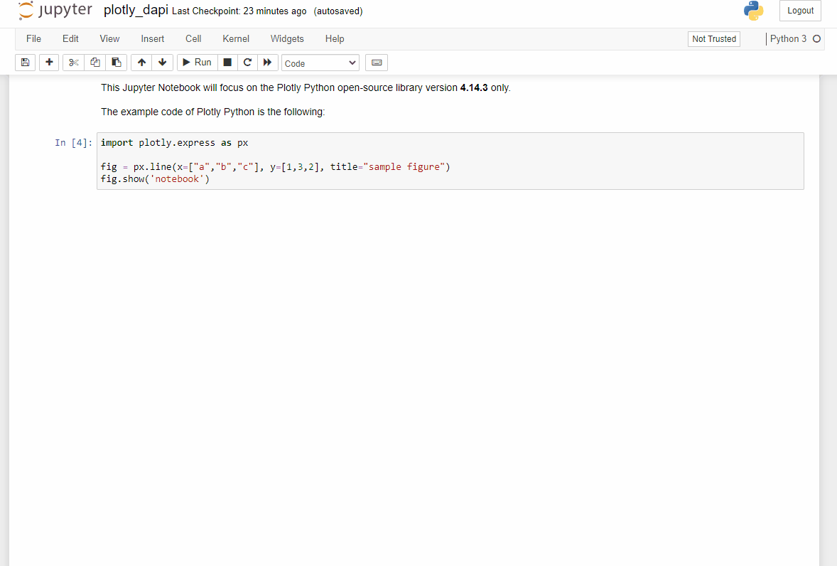
This article Notebook will focus on the Plotly Python open-source library versions 4.14.3, 5.0.0, and 4.5.2 (4.5.2 for the CodeBook environment only).
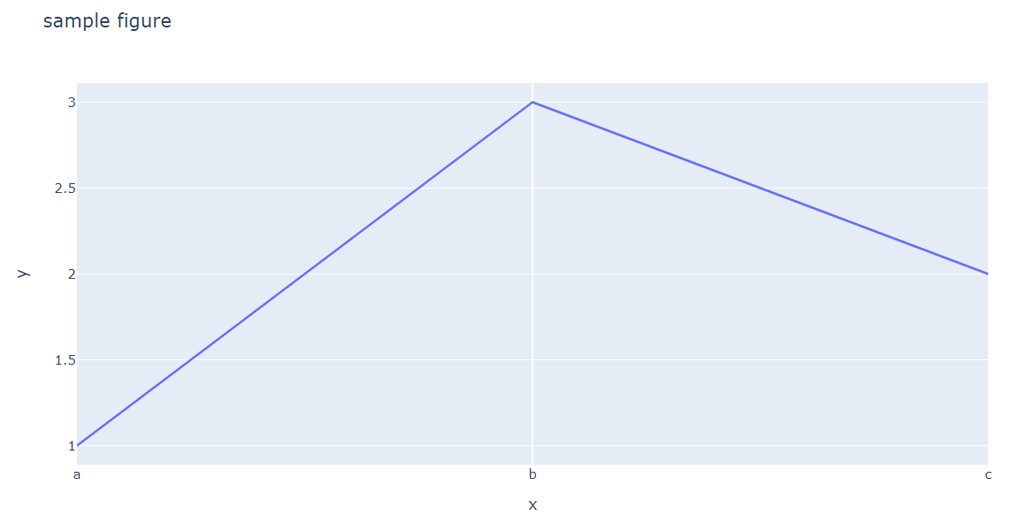
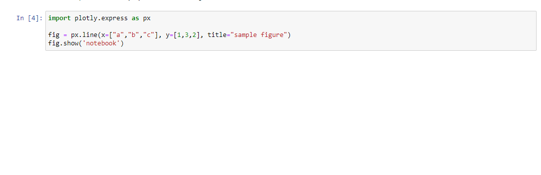
The example code of Plotly Python is the following:
import plotly.express as px
fig = px.line(x=["a","b","c"], y=[1,3,2], title="sample figure")
fig.show()
Introduction to Eikon Data API
The Eikon Data API (aka DAPI) provides access to certain Refinitiv Eikon/Refinitiv Workspace data with seamless workflow with the same data across all applications running on the desktop. The API allows developers to tap into the full breadth of community tools through a modern API with native Python support.

If you are not familiar with Eikon Data API or Python, the following resources are highly recommended to read before you proceed with further steps.
Note:
- This article is based on Eikon Data API versions 1.1.10 and 1.1.6.post3 (In the CodeBook application).
- Pleases see Eikon Data API Usage and Limits Guideline regarding the API data coverage and data limit.
Prerequisite
This example requires the following dependencies software and libraries.
- Refinitiv Eikon or Refinitiv Workspace application with access to Eikon Data APIs.
- Python Anaconda or MiniConda distribution/package manager.
- Classic Jupyter Notebook or JupyterLab applications
- Internet connection.
Note:
- This Project has been qualified with Python version 3.8.8 and Conda version 4.10.1
Please contact your Refinitiv's representative to help you to access Refinitiv Workspace/Eikon credentials. You can generate/manage the AppKey by follow the steps in Eikon Data API Quick Start page.
Code Walkthrough
Import Eikon Data API Libraries
The application needs to import Eikon and related libraries in order to interact with the Eikon Data API and Pandas.
# Eikon and Application Libraries
import eikon as ek
import datetime
import configparser as cp
import numpy as np
import pandas as pd
Then we intialize the Eikon Data API session by passing the app key information to the set_app_key() function.
# Initializes Eikon Data API session
ek.set_app_key('app_key')
COVID-19 Data
Let's start with the COVID-19 data which is available in the Refinitiv Workspace/Refinitiv Eikon platform via the following instrument's pattern:
- [Country Code]CCOV=ECI: Covid-19 Total Cases
- [Country Code]NCOV=ECI: Covid-19 New Cases
- [Country Code]ACOV=ECI: Covid-19 Active Cases
- [Country Code]RCOV=ECI: Covid-19 Recovered Cases
- [Country Code]DCOV=ECI: Covid-19 Death Cases
So, the example instruments of USA Covid-19 data are USCCOV=ECI, USNCOV=ECI, USACOV=ECI, USRCOV=ECI, and USDCOV=ECI instruments.
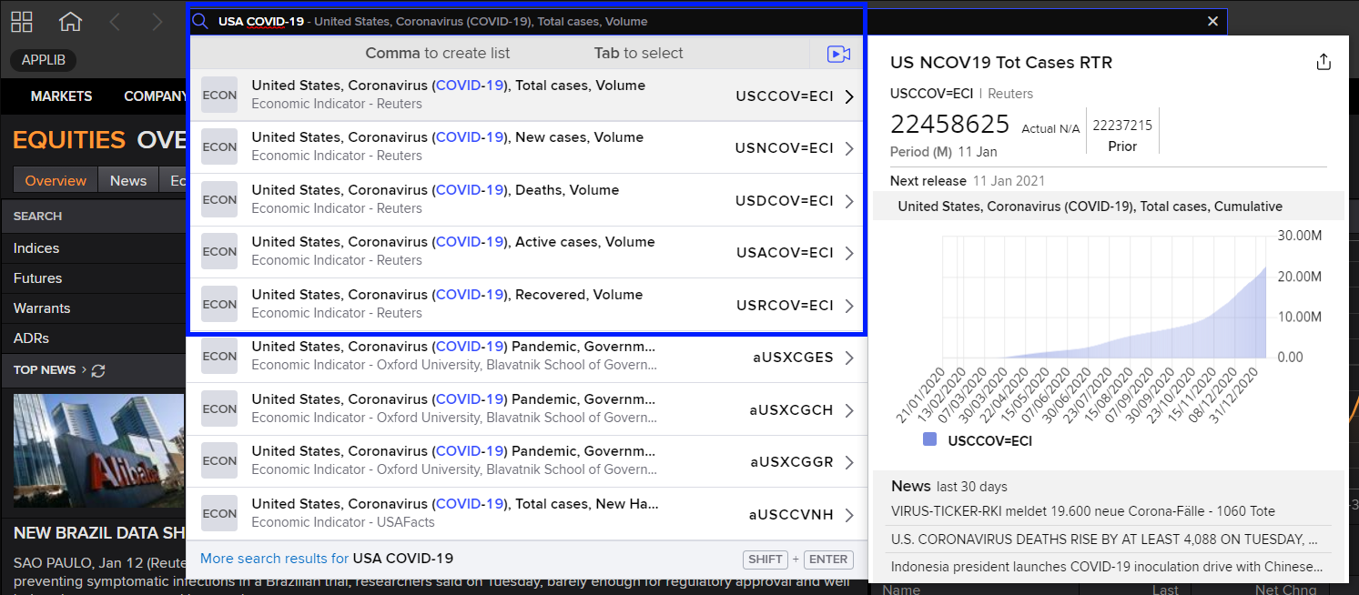
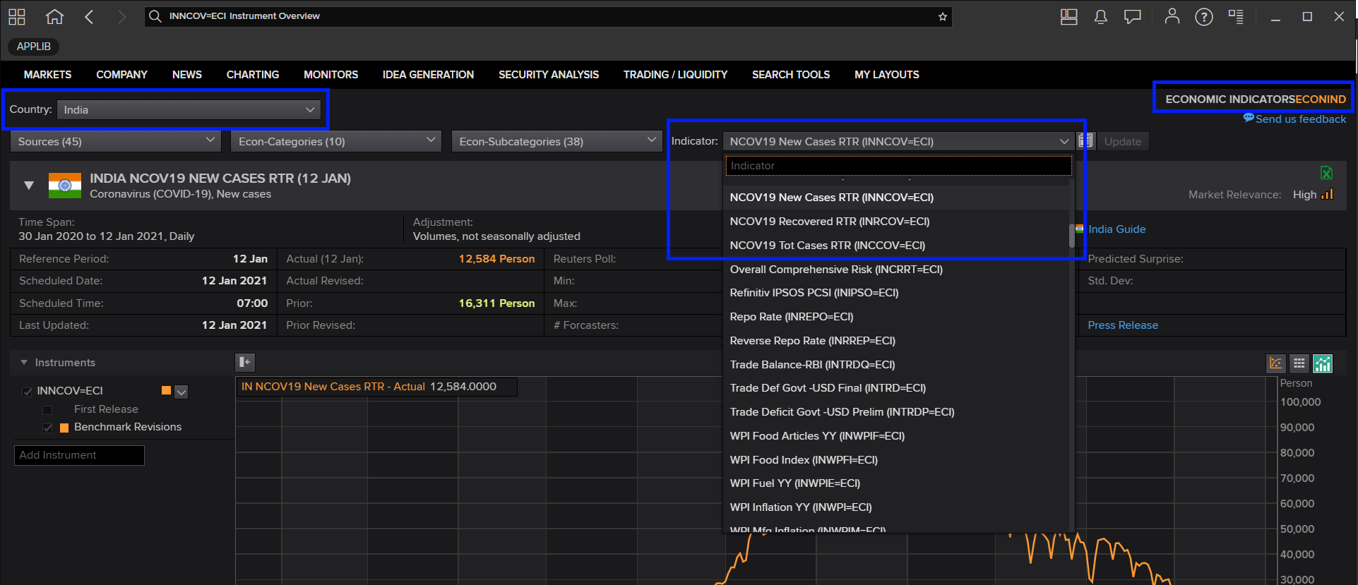
You can find each country's COVID-19 data from Workspace/Eikon Economic Indicators ("ECONNID") application, and then choosing Country and Indicator values.
The COVID-19 data provides detail with the following fields for users:
- DSPLY_NMLL: Display Name
- COUNTRY: Country code
- CF_DATE: Announcement Date
- ECON_ACT: Actual value
- ECON_PRIOR: Previous value
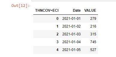
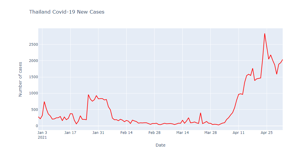
We will use Thailand New Cases history data from 1st January 2021 to 3rd May 2021 with Eikon Data API get_timeseries function as an example data for Plotly.
# Thailand New Cases
RIC = 'THNCOV=ECI'
df_thailand_historical_new_cases = ek.get_timeseries(RIC, start_date='2021-01-01', end_date='2021-05-03', interval='daily')
df_thailand_historical_new_cases.head()

Plotting Graph with Plotly Python
Like Matplotlib, Plotly also provides various low-level, high-level, helpers interfaces to create, manipulate and render graphical figures such as charts, plots, maps, diagrams, etc based on developer preference.
The Plotly Python figures are represented by tree-like data structures which are automatically serialized to JSON for rendering by the Plotly.js JavaScript library. Plotly provides the Graph Object as the low-level interface that wraps figures into a Python class and Plotly Express as the high-level interface for creating graphs.
Plotly Express
The Plotly Express package is the recommend entry-point to the Plotly Python library. It is the high-level interface for data visualization. The plotly.express module (usually imported as px) contains functions that can create entire figures at once and is referred to as Plotly Express or PX. Plotly Express is a built-in part of the plotly library and is the recommended starting point for creating the most common figures.
import plotly.express as px
Plotly Express provides more than 30 functions for creating different types of figures. The API for these functions was carefully designed to be as consistent and easy to learn as possible.
We will start with the Line Graph interface.
Line Plot with Plotly Express
The Line Plot interface is the easy-to-use function to create a 2D line graph using px.line() function.
We will plot a single line graph of Thailand COVID-19 new cases historical data with Date value as an X-axis and VALUE as the y-axis. We need to re-structure the Pandas Dataframe to include the Date index as a data column instead.
# Reset index to include Date as a data column
df_thailand_historical_new_cases.reset_index(level=0, inplace=True)
df_thailand_historical_new_cases.head()
We create the Plotly Figure object for the line chart with Plotly Express px.line() function. We pass the Date column as x-axis, VALUE column as y-axis, and the chart title information to the function.
Then we use the Figure update_traces() method to update figure traces such as line color and update_yaxes() method to update a figure's y-axes information.
Finally, we call the Figure show() function to draw a chart on Jupyter Notebook. Please noticed that we pass 'notebook' to the function to force the classic Jupyter notebook renderer for the classic Jupyter Notebook environment. If you are using JupyterLab, you can use just fig.show() statement.
fig = px.line(df_thailand_historical_new_cases, x="Date", y="VALUE", title='Thailand Covid-19 New Cases')
fig.update_yaxes(title_text='Number of cases') #Update Y-Axis title
fig.update_traces(line_color='#FF0000') #Update Chart color
fig.show()
Multiple Lines Graph
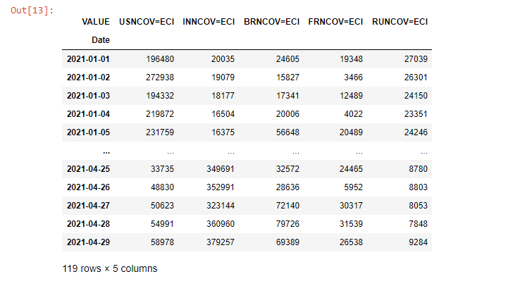
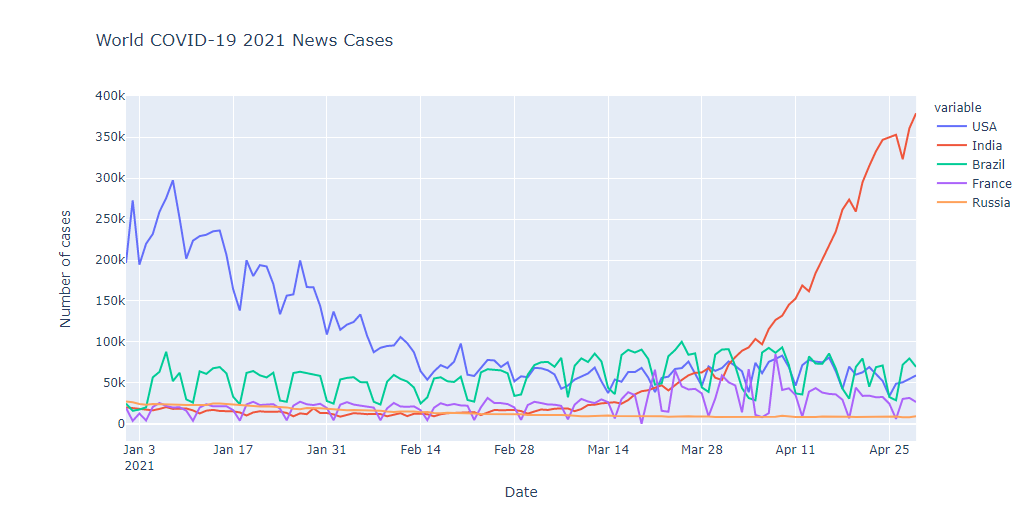
The Plotly Express Line also supports a multiple-lines graph. We use COVID-19 new cases data for the USA, India, Brazil, France, and Russia as example data to demonstrate the new case trends from 1st January 2021 to 3rd May 2021.
# Define RICs list
rics = ['USNCOV=ECI','INNCOV=ECI','BRNCOV=ECI','FRNCOV=ECI','RUNCOV=ECI']
# Call Eikon Data API get_timeseries function
df_historical_total_cases = ek.get_timeseries(rics, start_date='2021-01-01', end_date='2021-04-29', interval='daily')
df_historical_total_cases
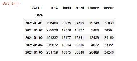
The current column names are the RIC names (USNCOV=ECI, INNCOV=ECI, etc.) which are hard to read, so we need to rename the column names to be readable Country names first.
df_historical_total_cases.rename(
columns= {'USNCOV=ECI':'USA', 'INNCOV=ECI':'India','BRNCOV=ECI':'Brazil','FRNCOV=ECI':'France','RUNCOV=ECI':'Russia'},
inplace = True
)
df_historical_total_cases.head()
Then we reset the Dataframe index to include the Date as a data column.
df_historical_total_cases.reset_index(level=0, inplace=True)
To plot multiple lines graph, we call the px.line() function by passing a list of column names as y-axis values.
fig = px.line(df_historical_total_cases,
x="Date",
y=['USA','India','Brazil','France','Russia'],
title='World COVID-19 2021 News Cases')
fig.update_yaxes(title_text='Number of cases')
fig.show()
Please see more detail regarding the Plotly Express Line chart in the following resources:
- Line Charts in Python page.
- Plotly Express Line API reference page.
- Creating and Updating Figures in Python page.
- Plotly Figure API reference page.
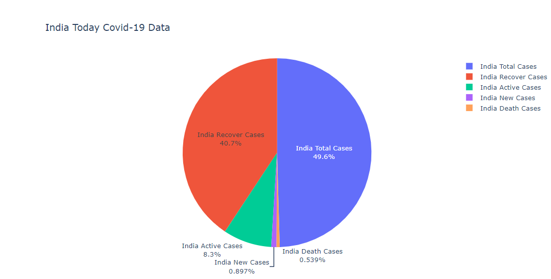
Pie Chart with Plotly Express
The Pie Chart interface is the easy-to-use function to create a circular statistical chart using px.pie() function.
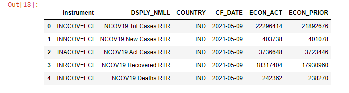
We will look into the India COVID-19 Today all data(Total Cases, New Cases, Active Cases, Recovered Cases, Death Cases) in detail, and plot data as a Pie Chart.
# India COVID-19 Data All Rics
rics_india_today = ['INCCOV=ECI','INNCOV=ECI','INACOV=ECI','INRCOV=ECI','INDCOV=ECI']
fields = ['DSPLY_NMLL', #Display Name
'COUNTRY', #Country code
'CF_DATE', #Announcement Date
'ECON_ACT', #Actual value
'ECON_PRIOR' #Previous value
]
df_india_today, err = ek.get_data(rics_india_today, fields)
df_india_today
In some cases, the Today data (ECON_ACT field) may be return (Nullable integer) based on the Day and Time that you execute the get_data function (most likely on the Fist day of the week).
To handle this situation, we need to check if all values in ECON_ACT column are null or not.
is_ECON_ACT_null = df_india_today['ECON_ACT'].isnull().all()
is_ECON_ACT_null
# If **is_ECON_ACT_null** is **True**, we will plot a Pie Chart with *ECON_PRIOR* value.
plot_value = 'ECON_ACT'
if is_ECON_ACT_null:
plot_value = 'ECON_PRIOR'
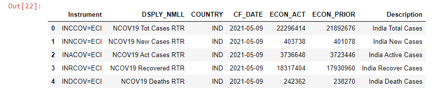
The returned DataFrame object looks fines but it is a bit too hard to read, so we will add a new column named Description to the DataFrame object which contains information about each Instrument definition.
# Dictionary Definitiion Pattern
covid19_rics_pattern = {
'CCOV=ECI': 'Total Cases',
'NCOV=ECI': 'New Cases',
'RCOV=ECI': 'Recover Cases',
'ACOV=ECI': 'Active Cases',
'DCOV=ECI': 'Death Cases'
}
# Get a List of readable Country Name and Event for adding new DataFrame column
def get_events_descriptions(list_rics):
list_result = []
for ric in list_rics:
event = ric[2:]
list_result.append('India {event}'.format(event = covid19_rics_pattern[event]))
return list_result
df_india_today['Description'] = get_events_descriptions(rics_india_today)
df_india_today
Finally, we call px.pie() function to create a figure object for a pie chart with the value of ECON_ACT (Actual value) field and Description column name.
For this pie chart, we use the Figure update_traces() method to update text display format on a figure.
For CodeBook Users!!
Please note that the CodeBook application has an older version of Plotly Python (version 4.5.2 as of May 2021), so px.pie() function for CodeBook will be slightly different.
# codebook_plotly_dapi.ipynb
fig = px.pie(df_india_today,
values= plot_value,
names= 'Description',
title= 'India Today Covid-19 Data'
)
fig.update_traces(textposition='auto', textinfo='percent+label')
fig.show() # CodeBook is based on JupyerLab
Please see more detail regarding the Plotly Express Pie chart in the following resources:
Plotly Graph Object
The Plotly Graph Object (plotly.graph_objects, typically imported as go) is the low-level interface that lets developers interact with Plotly Figure and IPYWidgets compatible for plotting graphs and manage data in detail. While the Plotly Express provides a simple way to create and customize graphs, the Plotly Graph Object lets developers create and customize more advanced graphs such as Group Bar Chart, Candlestick, Subplot of different types, etc.
# Import plotly.graph_objects module
import plotly.graph_objects as go
"Exploded" Pie Chart with Plotly Graph Object
The above pie chart has some sections that hard to read, so we will re-create that pie chart with Plotly Graph Object to pull out some sectors from the chart.
fig = go.Figure(data = [ go.Pie(
labels=df_india_today['Description'],
values=df_india_today[plot_value],
pull=[0, 0.2, 0, 0,0.2] #pull only some of the sectors
)])
fig.update_traces(textposition='auto', textinfo='percent+label')
fig.update_layout(title = 'India Today Covid-19 Data') # Set Title
fig.show()
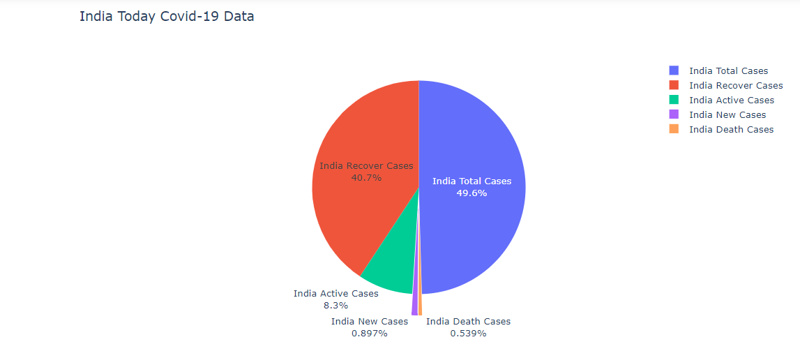
Please notice that you can set the chart title via the title property of fig.update_layout function when using the Graph Object.
Please see more detail regarding Plotly Graph Object Bar Chart in the following resources:
Bar Chart with Plotly Graph Object
We will use the Environmental, social and corporate governance (ESG) data of the Telecommunication companies as an example data for the Bar Chart example.
The ESG Data is available in Eikon/Refinitiv Workspace desktop application by a query for ESG in the menu.
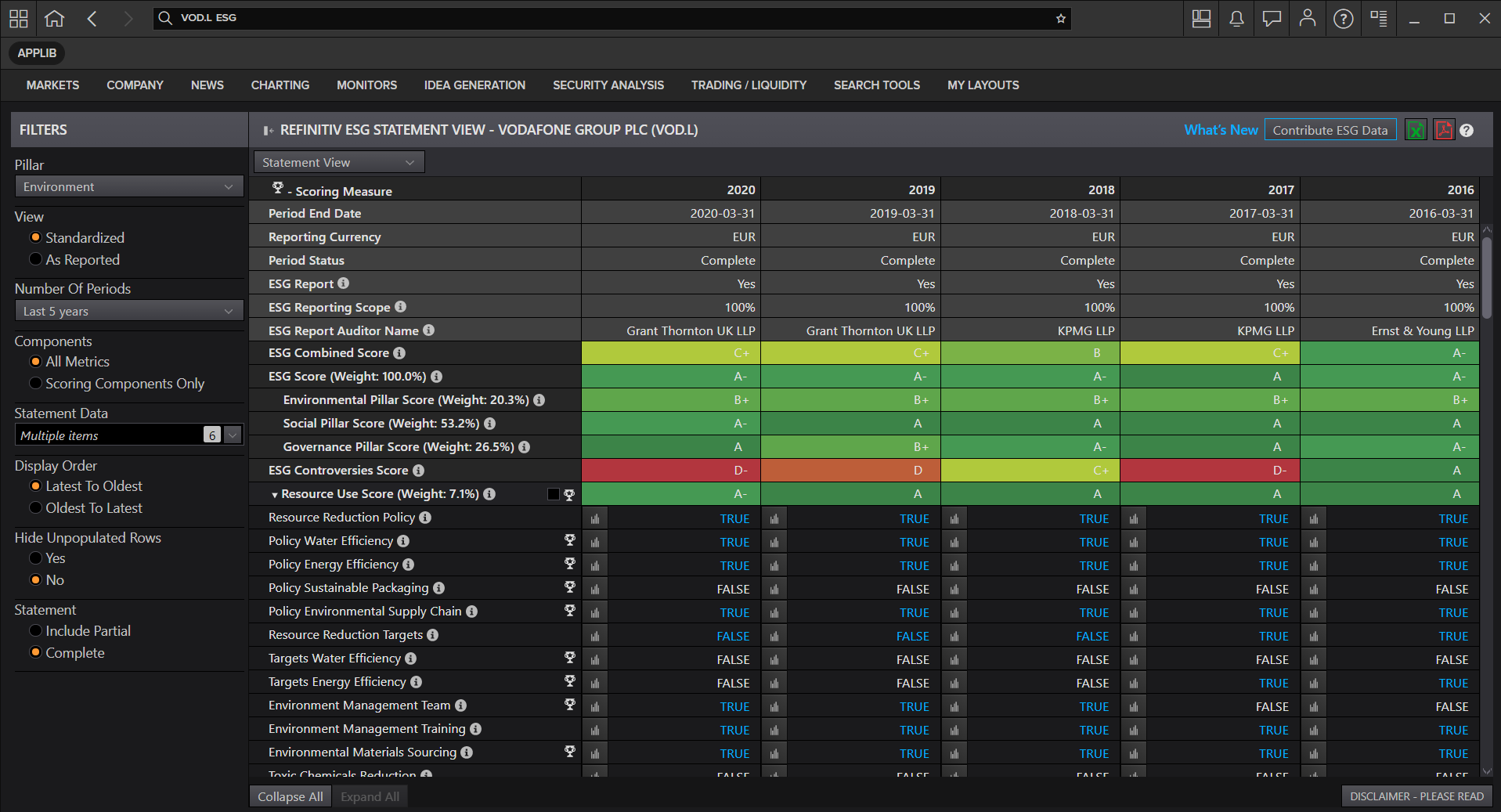
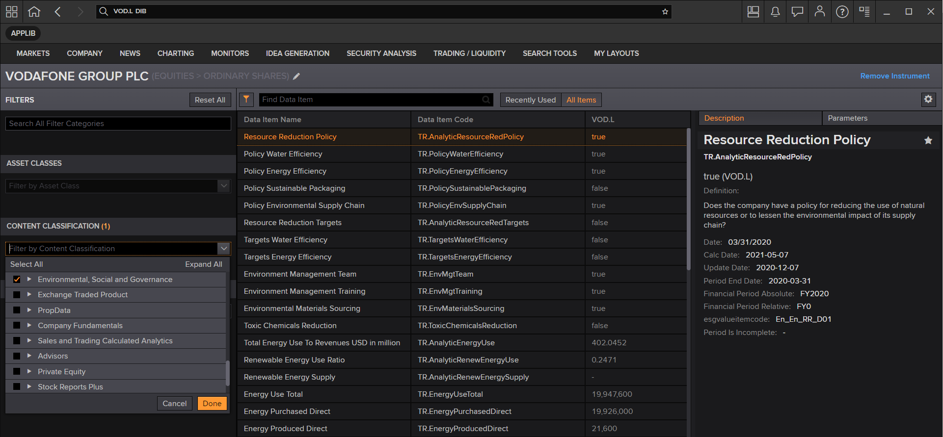
You can find ESG data fields from Eikon/Refinitiv Workspace Data Item Browser ("DIB") application and then choosing "Environmental, social and corporate governance" content classification.
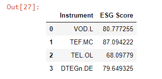
Firstly, we get the ESG Score data from the TR.TRESGScore field via Eikon Data API get_data() function.
# Define RICs list
universe = ['VOD.L','TEF.MC','TEL.OL','DTEGn.DE']
df_esg,eff = ek.get_data(universe, ['TR.TRESGScore'])
df_esg
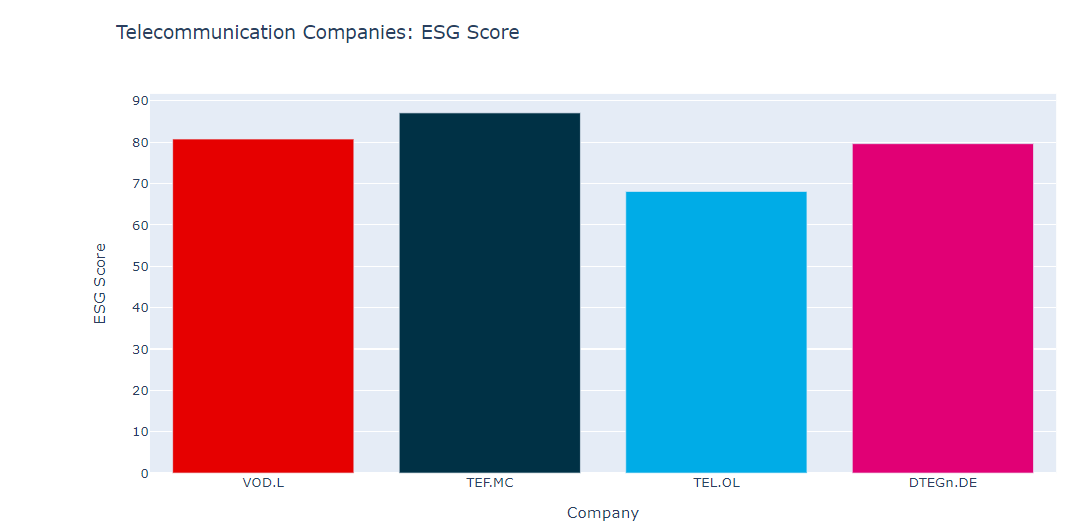
Then we create a Plotly Figure for the bar chart with go.Figure interface and go.Bar() class, then pass DataFrame Instrument column as the x-axis and ESG Score column as the y-axis.
Please notice that now we use the Figure update_layout() method to update figure's layout for the chart title.
colors = ['#E60000','#003145','#00ACE7','#E10075']
fig = go.Figure(go.Bar(x=df_esg['Instrument'],
y=df_esg['ESG Score'],
marker_color = colors
)) # Create Figure
fig.update_xaxes(title_text='Company') # Set X-Axis title
fig.update_yaxes(title_text='ESG Score') # Set &-Axis title
fig.update_layout(title = 'Telecommunication Companies: ESG Score')
fig.show()
However, the ESG Score data alone cannot be used without comparing it with the EST Controversies Score (field TR.TRESGCControversiesScore) and ESG Combined Score (field TR.TRESGCScore).
We will request the Company Name (TR.CompanyName), the ESG Scores to plot a group bar chart.
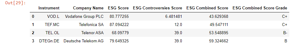
df_esg,eff = ek.get_data(universe, ['TR.CompanyName',
'TR.TRESGScore',
'TR.TRESGCControversiesScore',
'TR.TRESGCScore',
'TR.TRESGCScoreGrade'])
df_esg
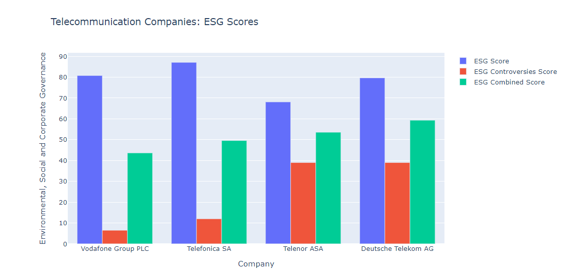
Then we create multiple go.Bar objects for each ESG score and pass it to go.Figure. Please notice that we need to set the layout to be a group bar chart via fig.update_layout(barmode='group') statement.
fig = go.Figure(data=[
go.Bar(name='ESG Score', x=df_esg['Company Name'], y=df_esg['ESG Score']),
go.Bar(name='ESG Controversies Score', x=df_esg['Company Name'], y=df_esg['ESG Controversies Score']),
go.Bar(name='ESG Combined Score', x=df_esg['Company Name'], y=df_esg['ESG Combined Score'])
])
fig.update_layout(barmode='group') # Change the bar mode
fig.update_xaxes(title_text='Company')
fig.update_yaxes(title_text='Environmental, Social and Corporate Governance')
fig.update_layout(title = 'Telecommunication Companies: ESG Scores')
fig.show()
Please see more detail regarding Plotly Graph Object Bar Chart in the following resources:
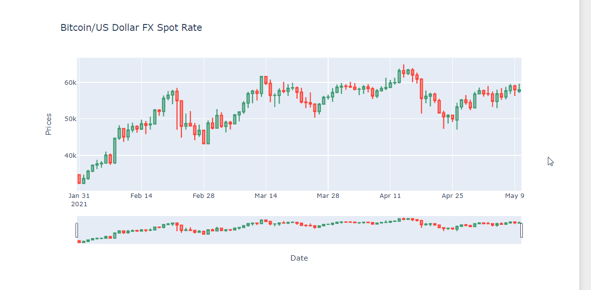
Candlestick Chart with Plotly Graph Object
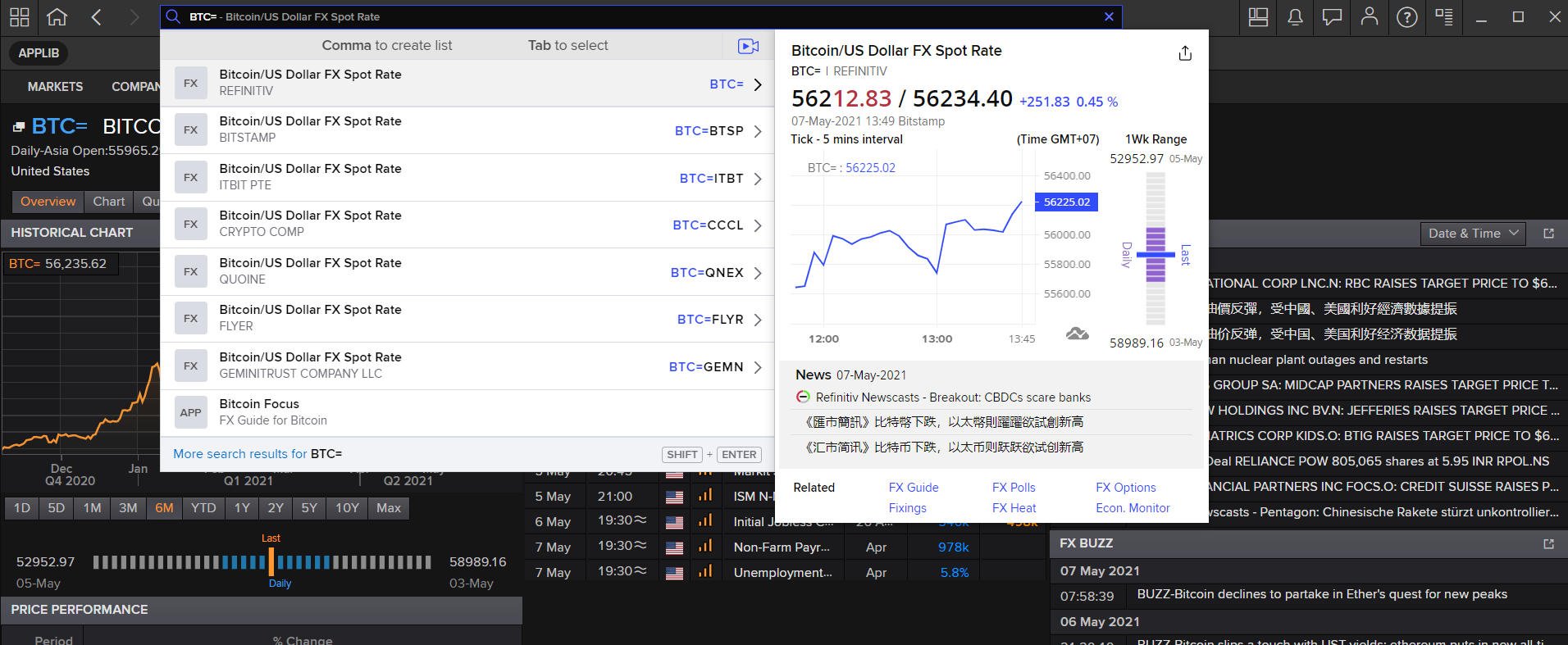
The last example is the Candlestick charts using Plotly Graph Object. We will use Bitcoin/US Dollar FX Spot Rate as an example dataset that is suitable for the candlestick chart.
The Bitcoin/US Dollar FX Spot Rate data is available in Eikon/Workspace and Refinitiv Real-Time as BTC= instrument name.
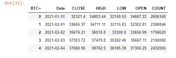
We request 180 daily historical data of BTC= via Eikon Data API get_timeseries function.
df_bitcoin = ek.get_timeseries(rics = 'BTC=',interval = 'daily',count = 180)
df_bitcoin.head()
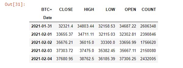
Then we re-structure the DataFrame index to change the *Date* column from an index column to a data column.
df_bitcoin.reset_index(level=0, inplace=True)
df_bitcoin.head()
Finally, we use the go.Candlestick object to create the candlestick chart from Dataframe, and pass it to go.Figure to create a Plotly Figure object to plot a graph.
fig = go.Figure(data=[go.Candlestick(x=df_bitcoin['Date'],
open=df_bitcoin['OPEN'],
high=df_bitcoin['HIGH'],
low=df_bitcoin['LOW'],
close=df_bitcoin['CLOSE'])])
fig.update_xaxes(title_text='Date')
fig.update_yaxes(title_text='Prices')
fig.update_layout(xaxis_rangeslider_visible=True, # Set Range Slider Bar
title = 'Bitcoin/US Dollar FX Spot Rate') # Set Title
fig.show()
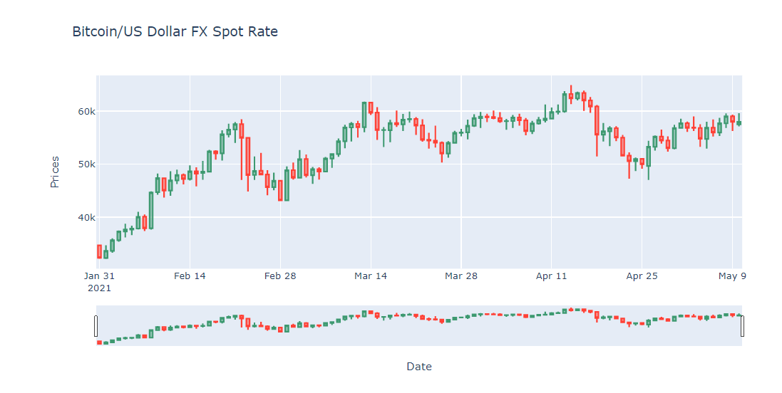
We can interact with the chart range slider bar too.
Please see more detail regarding Plotly Graph Object Candlestick Chart in the following resources:
- Candlestick Charts in Python page.
- Candlestick Charts API reference page.
- Plotly Graph Object Figure API reference page.
Eikon Data API Setup
Please follow a step-by-step guide to set up your Eikon Data API and your AppKey in Eikon Data API Quick Start page.
How to run the example Notebooks
Please note that the Refinitiv Workspace/Eikon application integrates a Data API proxy that acts as an interface between the Eikon Data API Python library and the Eikon Data Platform. For this reason, the Refinitiv Workspace/Eikon application must be running when you use the Eikon Data API Python library.
The first step is to unzip or download the example project folder from GitHub into a directory of your choice, then follow the step-by-step guide in the GitHub repository:
- How to run this example with the Classic Jupyter Notebook section and open plotly_dapi.ipynb notebook file for the classic Jupyter Notebook environment.
- How to run this example with the JupyterLab section and open jupyterlab_plotly_dapi.ipynb notebook file for the JupyterLab environment.
- How to run this example with the CodeBook section, then upload and open codebook_plotly_dapi.ipynb notebook file for the Eikon/Workspace CodeBook environment.
Troubleshooting
Sometimes the classic Jupyter Notebook encounters the problem when you close the notebook window and re-open it, your plots render as blank spaces.
You can check if the notebook document is trusted on the top-right menu of the notebook application.
Please click that button to enable JavaScript for display in this notebook.
As a last resort, you can "Restart & Clear Output" from the Kernel menu and rerun your notebook. You can find more detail on Jupyter Classic Notebook Problems and Troubleshooting pages.
Conclusion
Data visualization is the first impression of data analysis for the readers. Data Scientists, Financial coders, and Developers take time on the data visualization process longer than the time they use for getting the data. It means the data visualization/chart library need to be easy to use, flexible and have a good document.
Plotly Python provides both ease-of-use/high-level and low-level interfaces for supporting a wide range of Developers' skills. Developers can pick the Plotly Chart object (line, bar, scatter, candlestick, etc) that match their requirements, check the Plotly example code and community page to create a nice chart with readable and easy to maintain source code.
When compare to the Matplotlib Pyplot (which is the main player in the Charting library), the Plotly advantages and disadvantages are the following:
Pros
- Use a few lines of code to create and customize the graph.
- Provide more than 30 ease-of-use various chart object types for Developers.
- Experience Developers can use the low-level chart object types to create a more powerful and flexible chart.
- Simplify documents and example code.
- Provide a dedicated paid support program for both individual and corporate developers.
Cons
- Some API Interface and installation processes for Classic Jupyter Notebook and Jupyter Lab are different.
- Matplotlib Pyplot has larger users based on developer community websites (such as StackOverflow). It means a lot of Pyplot questions, problems will be easy to find the answers or solutions than Plotly.
- Matplotlib Pyplot has larger documents, tutorials, step-by-step guide resources from both official and user-based websites.
- The plots render as blank spaces sometimes when you reopen the classic Jupyter Notebook (see troubleshooting page)
At the same time, the Eikon Data API lets developers rapidly access Refinitiv Eikon/Refinitiv Workspace data and our latest platform capabilities with a few lines of code that easy to understand and maintain.
References
You can find more detail regarding the Plotly, Eikon Data APIs, and related technologies from the following resources:
- Refinitiv Eikon Data API page on the Refinitiv Developer Community website.
- Plotly Official page.
- Plotly Python page.
- Plotly GitHub page
- Plotly Express page
- Plotly Graph Objects page
- Creating and Updating Figures in Python page
- Plotly Figure API reference page
- 4 Reasons Why I’m Choosing Plotly as My Main Visualization Library
- Eikon Data API Quick Start Guide page.
- Eikon Data API Tutorial page.
- Python Quants Video Tutorial Series for Eikon API.
- Eikon Data APY Python Reference Guide.
- Eikon Data API Troubleshooting article.
- Get Corona Virus Cases Latest And Time-series Statistic with Eikon Data API(Python) example
For any question related to this example or Eikon Data API, please use the Developers Community Q&A Forum.
GitHub
Plotting Financial Data Chart with Plotly Python GitHub repository.