
Overview
This article shows how to use Refinitiv Eikon Data API to consume company geographic sale data from Refinitiv Fundamentals, then breakdown and display each region revenue in readable graph format in the classic Jupyter Notebook application.
Refinitiv's Reuters Fundamentals Overview
Reuters Fundamentals has over 35 years of experience in collecting and delivering the most timely and highestquality fundamentals data in the industry, including an unmatched depth and breadth of primary financial statements, footnote items, segment data, industry specific operating metrics, financial ratios, and much more.
Reuters Fundamentals standardized and As Reported financial statement data – both interim and annual – along with per-share data, calculated financial ratios, company profile information, security data, Officers & Directors and market content for over 90,000 issuers.
Geographic Breakdown Fundamentals Data
The Company's geographic breakdown fundamentals data are listed under the following Eikon Data fields:
- TR.BGS.GeoTotalRevenue.segmentName: Segment (Geographic) data
- TR.BGS.GeoTotalRevenue: Each segment revenue value
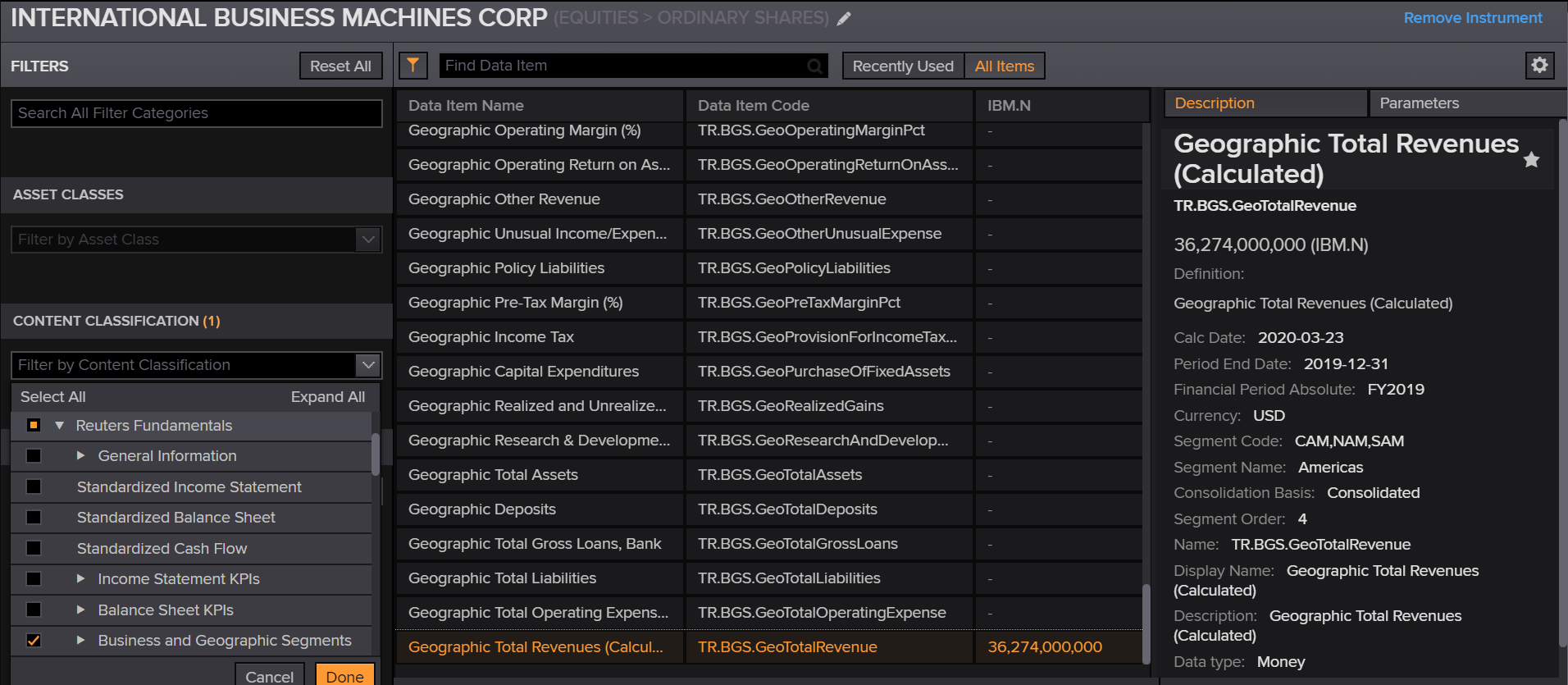
This information can be searched in Refinitiv Workspace (or Eikon desktop) Data Item Browser application under Content Classification -> Reuters Fundamentals -> Business and Geographic Segments - Geographic Segment.
Implementation Process
The demo application is available at GitHub page. Please check the project README.md file for more detail regarding how to run the Jupyter Notebook application.
There are three main steps to get and display company's geographic sale data.
- Get the Company Geographic Sale Data.
- Restructure Company Geographic Sale Data Dataframe object that returned from Eikon Data API.
- Plotting the graph.
Get the Company Geographic Sale Data
Firstly, we use request company fundamentals via Eikon Data API get_data function with following fields:
- TR.BGS.GeoTotalRevenue.segmentName: Segment (Geographic) data
- TR.BGS.GeoTotalRevenue: Each segment revenue value
- TR.CompanyName: Get company name
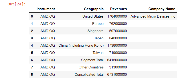
We will use AMD.OQ RIC to display Advanced Micro Devices, Inc data as an example.
df,err = ek.get_data('AMD.OQ', ['TR.BGS.GeoTotalRevenue.segmentName', 'TR.BGS.GeoTotalRevenue','TR.CompanyName'])
df
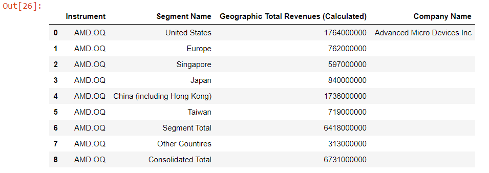
This get_data function returns data as Pandas Dataframe object by default.
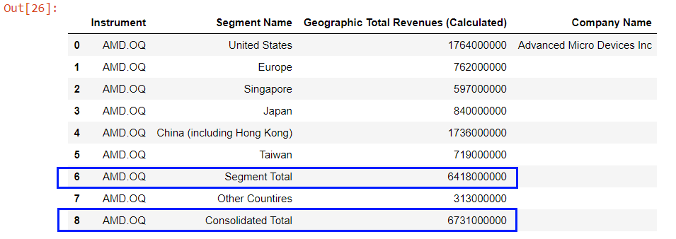
The returned Dataframe contains the total sale values of all regions in Segment's Segment Total and Consolidated Total rows. In the same time, the company name information is available at the first row of Dataframe object which is the only row that contains Company Namecolumn data.
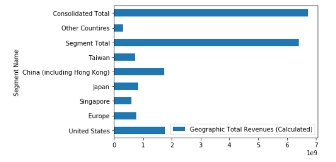
Lets try plotting a graph
Basically, we can use this Dataframe to plot a bar graph as it is. However, the result is hard to read and analysis sale revenue at all.
df.set_index('Segment Name',drop=True,inplace=True)
fig = plt.figure()
df.plot(kind='barh', ax = fig.gca())
plt.show()
So we need to restructure the Dataframe and make data easier to read before plotting a graph.
Restructure Company Geographic Sale Data Dataframe object.
We start by renaming the Segment Name and Geographic Total Revenues (Calculated) columns to readable names like Geographic and Revenues.
df_graph = df.copy()
df_graph.rename(columns={
'Segment Name':'Geographic',
'Geographic Total Revenues (Calculated)':'Revenues'},
inplace = True)
df_graph
Then we get the Company name and consolidate total revenue information from Dataframe object.
total_sale = df_graph.iloc[df_graph.shape[0] - 1]['Revenues']
company_name = df_graph.iloc[0]['Company Name']
And the last thing on this phase is to remove the Total Sale Revenue rows from the Dataframe, we will display the consolidated revenue information as a graph footer intead.
df_graph = df_graph[df_graph['Geographic'] != 'Segment Total']
df_graph = df_graph[df_graph['Geographic'] != 'Consolidated Total']
Plotting the graph
Finally, we are now ready for plotting a readable graph. We create a Python function format_revenues_number to reformat large revenue numbers into a readable numbers in trillions, billions or millions unit. This function source code is based on Dan Friedman's How to Format Large Tick Values tutorial source code via GitHub.
def format_revenues_number(tick_val, pos):
"""
Turns large tick values (in the trillions, billions, millions and thousands) such as 4500 into 4.5K
and also appropriately turns 4000 into 4K (no zero after the decimal).
"""
if tick_val >= 1000000000000: # Add support for trillions
val = round(tick_val/1000000000000, 1)
new_tick_format = '{:}T'.format(val)
elif tick_val >= 1000000000:
val = round(tick_val/1000000000, 1)
new_tick_format = '{:}B'.format(val)
elif tick_val >= 1000000:
val = round(tick_val/1000000, 1)
new_tick_format = '{:}M'.format(val)
elif tick_val >= 1000:
val = round(tick_val/1000, 1)
new_tick_format = '{:}K'.format(val)
elif tick_val < 1000:
new_tick_format = round(tick_val, 1)
else:
new_tick_format = tick_val
# make new_tick_format into a string value
new_tick_format = str(new_tick_format)
"""
code below will keep 4.5M as is but change values such as 4.0M to 4M since that
zero after the decimal isn't needed
"""
index_of_decimal = new_tick_format.find(".")
if index_of_decimal != -1:
value_after_decimal = new_tick_format[index_of_decimal+1]
if value_after_decimal == "0":
# remove the 0 after the decimal point since it's not needed
new_tick_format = new_tick_format[0:index_of_decimal] + new_tick_format[index_of_decimal+2:]
return new_tick_format
We use Python matplotlib.pyplot library to plot a bar graph that represent each region revenue from restructured Dataframe object in Jupyter Notebook.
# Plotting a Graph
df_graph.set_index('Geographic',drop=True,inplace=True)
fig = plt.figure()
#Format Total Sale display unit as a graph footer.
fig.text(.5, -.05, 'Total Sale %s' %(f'{total_sale:,.2f}'), ha='center',fontsize='large')
# Create graph title from Company and RIC names dynamically.
plt.ticklabel_format(style = 'plain')
plt.title('%s (%s) Geographic Sale Breakdown' % (company_name, 'AMD.OQ'), color='black',fontsize='x-large')
ax = fig.gca()
#Apply Sale data into millions function.
formatter = FuncFormatter(format_revenues_number)
ax.xaxis.set_major_formatter(formatter)
df_graph.plot(kind='barh', ax = fig.gca())
plt.show()
The result of above code is following:
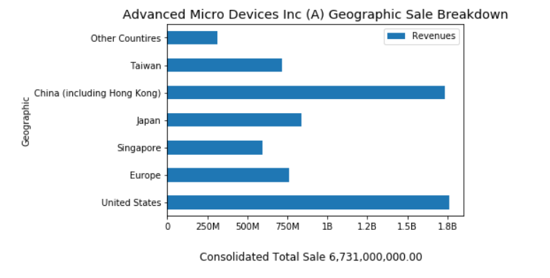
Note: You can adjust a graph size to match your preference and data via a figsize parameter of Dataframe.plot() function.
- Reference: Dataframe.plot() function
Next Steps
Once you can retrieve Company Geographic Revenue data, you can get each company RIC from your interested index RIC (such as 0#.DJIfor Dow Jones Industrial Average) via Eikon Data API get_data function and then get returned each RIC Company Geographic Revenue.
df,err = ek.get_data('0#.DJI',['TR.CompanyName'])
# Get a list of RICs for the first 5 rows of returned Dataframe object.
rics = data.head()['Instrument'].tolist()
# Get Geographic Revenue Data
df,err = ek.get_data(rics[0], ['TR.BGS.GeoTotalRevenue.segmentName', 'TR.BGS.GeoTotalRevenue','TR.CompanyName'])
# Continue Dataframe and graph process
...
For more detail regarding Eikon Data APIs, please check Eikon Data API page Product page.
Conclusion
Refinitiv provides a wide range of Reuters Fundamentals data for your investment decisions including company geographic sale information. This information helps you analysis the revenue from each geographic region of your interested company in both panel data and graph formats.
References
- Refinitiv Eikon Data API page on the Refinitiv Developer Community web site.
- Eikon Data API Quick Start Guide page.
- Eikon Data API Tutorial page.
- Python Quants Video Tutorial Series for Eikon API.
- Eikon Data APY Python Reference Guide.
- Eikon Data API Troubleshooting article.
- Dan Friedman's Python programming, data analysis, data visualizations tutorials.
- Pandas API Reference.
- Pyplot Graph API Reference.
For any question related to this example or Eikon Data API, please use the Developers Community Q&A Forum.