
Author:

Bokeh Overview
Bokeh is a Python library for creating interactive visualizations for modern web browsers including Jupyter Notebook and Refinitiv CodeBook. It allows users to create ready-to-use appealing plots and charts nearly without much tweaking.
Bokeh has been around since 2013. It targets modern web browsers to present interactive visualizations rather than static images. Bokeh provides libraries in multiple languages, such as Python, R, Lua, and Julia. These libraries produce JSON data for BokehJS (a Javascript library), which in turn creates interactive visualizations displayed on modern web browsers. Bokeh provides many benefits including:
- Simple to complex visualizations: Bokeh provides different interfaces that target users of many skill levels. Users can use basic interfaces for quick and straightforward visualizations or use advanced interfaces for more complex and extremely customizable visualizations.
- Easy to use with Pandas: Bokeh provides the ColumnDataSource class which is a fundamental data structure of Bokeh. Most plots, data tables, etc. will be driven by a ColumnDataSource. Users can also assign a Pandas data frame as a data source to plot charts.
- Support several output mediums: The output from Bokeh can be displayed on modern web browsers including Jupyter Notebook. The output can also be exported to an HTML file. Moreover, Bokeh can be used to create interactive web applications by running them on the Bokeh server.
Bokeh provides different levels of interfaces for users to choose from basic plots with very few customizable parameters to advanced plots with full control over their visualizations. Typically, the interfaces are divided into two levels:
- bokeh.plotting: The intermediate-level interface that is comparable to Matplotlib. The workflow is to create a figure and then enrich this figure with different elements that render data points in the figure.
- bokeh.models: The low-level interface that provides the maximum flexibility to application developers. This interface provides complete control over how Bokeh plots are assembled, configured, and displayed.
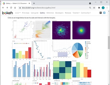
The examples in this article mostly rely on the bokeh.plotting interface. You can refer to the Bokeh Gallery for the list of available charts and examples.
Refinitiv CodeBook
CodeBook is an application in Refinitiv Eikon or Workspace that allows users to access a cloud-hosted development environment for Python scripting, and leverage the Refinitiv APIs to rapidly build and deploy models, apps, and analytics that fit workflow needs.
CodeBook provides many pre-installed Python libraries for developers or data scientists to retrieve data from Refinitiv's platforms, process the data, plot charts, build machine learning models, and much more.
Bokeh is one of the pre-installed visualization Python libraries in the CodeBook environment. In addition to Bokeh, there are other charting libraries available in CodeBook, such as altair, bqplot, matplotlib, plotly, and seaborn.
This article demonstrates how to use Bokeh to visualize financial data retrieved from Refinitiv APIs.
Sample Usages
The following examples below demonstrate how to use Bokeh to plot several charts to visualize the financial data retrieved from the Eikon Data API. The examples also show how to create layouts to display charts in the notebook cells.
Please follow the steps below to run the examples.
Prerequisite
The code can be run on Refinitiv Codebook or Jupyter Notebook that has the Bokeh and Eikon Data API libraries installed. You can verify the version of Bokeh installed in Refinitiv Codebook from the Libraries&Extensions.md file.
Import required libraries
First, the Python libraries, such as Eikon Data API, Bokeh, and utilities, are imported to retrieve the data, process the data, and plot charts.
import refinitiv.dataplatform.eikon as ek
from bokeh.plotting import figure, show
from bokeh.io import output_notebook
from bokeh.models import ColumnDataSource, CDSView, BooleanFilter, HoverTool, FactorRange
from bokeh.transform import factor_cmap, cumsum
from bokeh.layouts import row, column, gridplot
from bokeh.models.widgets import Tabs, Panel
import pandas as pd
from math import pi
import datetime
Then, initialize the Eikon Data API with the application key and call the output_notebook() method to configure the default output state to generate output in notebook cells when the show() method is called.
ek.set_app_key('DEFAULT_CODE_BOOK_APP_KEY')
output_notebook()

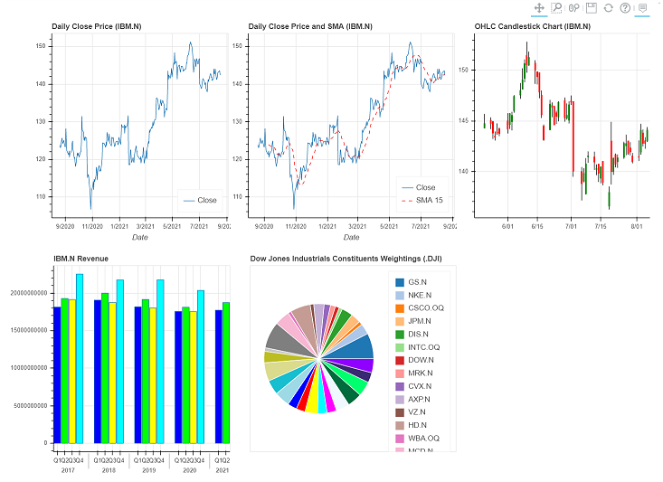
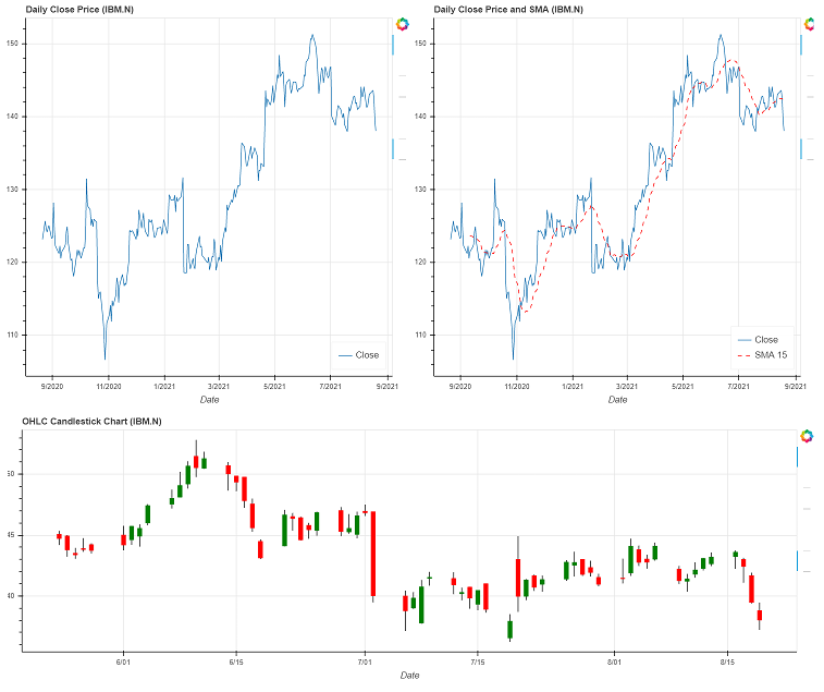
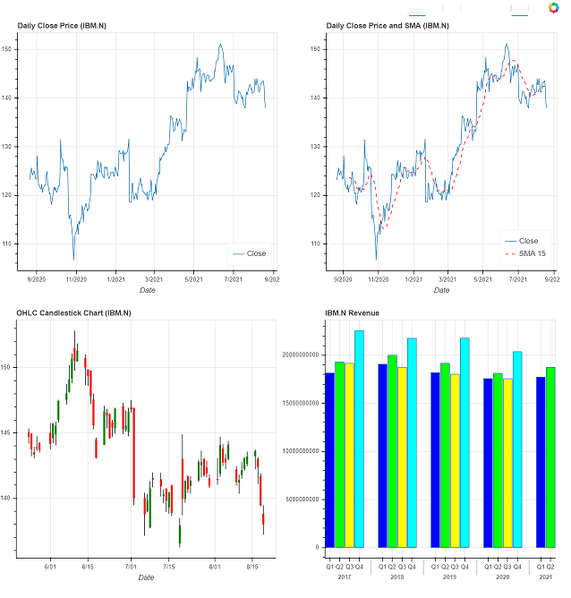
Line Chart
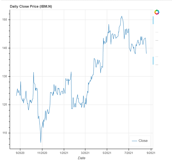
This example shows how to use Bokeh to plot a line chart that displays the daily historical close prices retrieved from the Eikon Data API.
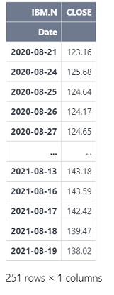
The get_timeseries method of the Eikon Data API is called to retrieve the daily historical close prices of IBM.N.
df1 = ek.get_timeseries('IBM.N',
fields=['CLOSE'],
start_date=datetime.timedelta(days=-365),
end_date=datetime.datetime.now(),
interval='daily')
df1
Then, it creates a Bokeh figure and adds a line chart to the figure. It assigns the data frame retrieved from the get_timeseires method as a data source of the line chart to plot the data from the Date and CLOSE columns. It also adds a hover tool to the figure to interactively display the data when the cursor hovers over the line chart. Next, it calls the show method to display the figure.
figure1 = figure(title="Daily Close Price (IBM.N)",
x_axis_type="datetime",
x_axis_label='Date')
figure1.line(x='Date', y='CLOSE', source=df1, legend_label="Close")
figure1.add_tools(HoverTool(
tooltips=[
( "Date", "$x{%F}" ),
( "Price", "$y{"+f"0.00"+" a}" )
],
formatters={
'$x' : 'datetime',
},
))
figure1.legend.location = 'bottom_right'
show(figure1)
Line Chart with Multiple Lines
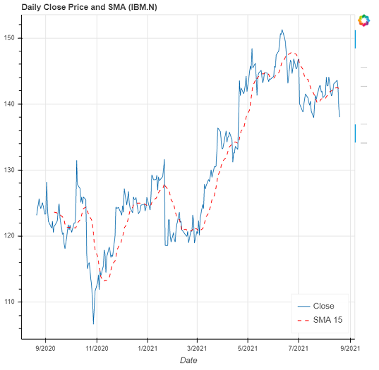
This example enhances the previous line chart by adding another line that shows the 15-days simple moving averages of the close prices.
It uses the rolling and mean methods to calculate the 15-days simple moving averages of the close prices and creates a new column (SMA_15) in the data frame with the calculated values.
df1['SMA_15'] = df1.CLOSE.rolling(15).mean()
df1
Then, it creates a new figure with a line chart that is similar to the previous step and adds another dashed line that represents the data in the SMA_15 column to the figure.
| figure2.line(x='Date', y='SMA_15', source=df1, legend_label="SMA 15", line_dash = 'dashed', color="red", name="SMA 15") |
Next, it calls the show method to display the figure.
figure2 = figure(title="Daily Close Price and SMA (IBM.N)",
x_axis_type="datetime",
x_axis_label='Date')
figure2.line(x='Date', y='CLOSE', source=df1, legend_label="Close", name="CLOSE")
figure2.line(x='Date', y='SMA_15', source=df1, legend_label="SMA 15", line_dash = 'dashed', color="red", name="SMA 15")
figure2.add_tools(HoverTool(
tooltips=[
( "", "$name"),
( "Date", "$x{%F}" ),
( "Price", "$y{"+f"0.00"+" a}" )
],
formatters={
'$x' : 'datetime',
},
))
figure2.legend.location = 'bottom_right'
show(figure2)
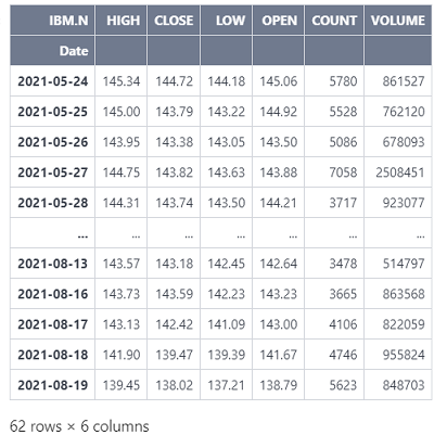
df2 = ek.get_timeseries('IBM.N',
start_date=datetime.timedelta(days=-90),
end_date=datetime.datetime.now(),
interval='daily')
df2
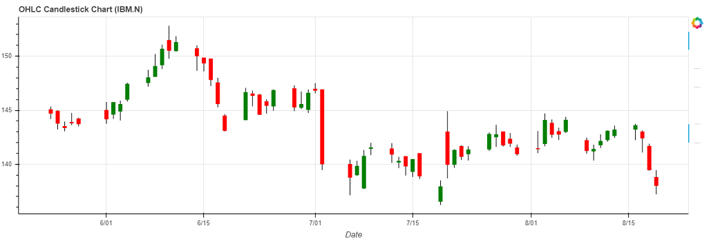
Then, it creates a new figure that contains segment and vertical bar glyphs. The segment glyphs are used to visualize the low and high prices and the vertical bar glyphs are used to visualize the open and close prices. If the close prices are more than or equal to the open prices, the color of the vertical bar glyphs will be green. Otherwise, the color of the vertical bar glyphs will be red.
It also adds a hover tool to the figure to interactively display the OHLC data when the cursor hovers over the chart. Next, it calls the show method to display the figure.
source = ColumnDataSource(data=df2)
hover = HoverTool(
tooltips=[
('', '@Date{%F}'),
('O', '@OPEN{"+f"0.00"+" a}'),
('H', '@HIGH{"+f"0.00"+" a}'),
('L', '@LOW{"+f"0.00"+" a}'),
('C', '@CLOSE{"+f"0.00"+" a}'),
('V', '@VOLUME{0}'),
],
formatters={
'@Date': 'datetime'
},
mode='mouse'
)
inc_b = source.data['CLOSE'] >= source.data['OPEN']
inc = CDSView(source=source, filters=[BooleanFilter(inc_b)])
dec_b = source.data['OPEN'] > source.data['CLOSE']
dec = CDSView(source=source, filters=[BooleanFilter(dec_b)])
w = 12*60*60*1000
figure3 = figure(title="OHLC Candlestick Chart (IBM.N)",
x_axis_type="datetime",
sizing_mode="stretch_width",
height=400,
x_axis_label='Date')
figure3.segment(source=source, x0='Date', x1='Date', y0='HIGH', y1='LOW', color="black")
figure3.vbar(source=source, view=inc, x='Date', width=w, top='OPEN', bottom='CLOSE', fill_color="green", line_color="green")
figure3.vbar(source=source, view=dec, x='Date', width=w, top='OPEN', bottom='CLOSE', fill_color="red", line_color="red")
figure3.add_tools(hover)
show(figure3)
quarter = pd.Timestamp(datetime.date.today()).quarter
quarter = quarter + 14
quarter = quarter*-1
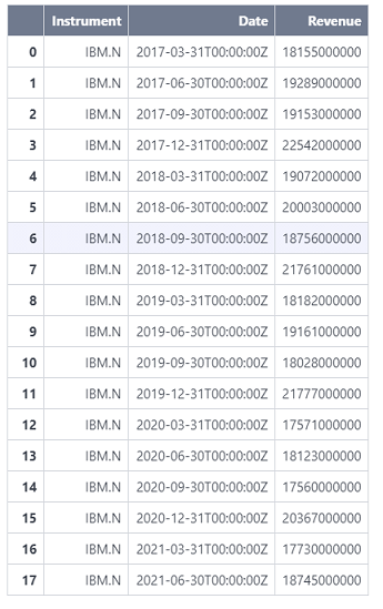
df3, err = ek.get_data(
instruments = ['IBM.N'],
fields = ['TR.Revenue.Date','TR.Revenue'],
parameters={'SDate':0,'EDate':quarter,'Period':'FQ0','Frq':'FQ'}
)
df3 = df3[::-1].reset_index().drop('index', axis=1)
df3
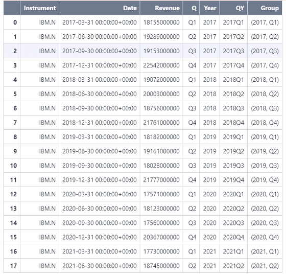
Next, it adds the following columns to the data frame.
- Q: Quarter, e.g., Q1, Q2, Q3, or Q4.
- Year: Year, e.g., 2021.
- QY: Quarter and year, e.g., 2021Q1
- Group: Tuples of 'Year' and 'Q', e.g., (2021, Q2)
These columns are used by Bokeh to plot the nested verticle bar chart.
df3['Date'] = pd.to_datetime(df3['Date'], format='%Y-%m-%d')
df3['Q'] = ('Q' + df3['Date'].dt.quarter.astype(str))
df3['Year'] = df3['Date'].dt.to_period("Y").astype(str)
df3['QY'] = df3['Date'].dt.to_period("Q").astype(str)
df3['Group'] = df3[['Year', 'Q']].apply(lambda x: (x[0],str(x[1])), axis=1)
df3
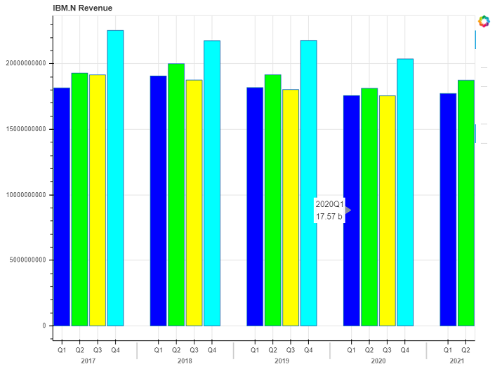
Next, it creates a new figure and then adds the vertical chart to the figure. It uses the Group column in the data frame as the x-coordinates of the vertical bar to create the nested vertical bar chart.
It also adds a hover tool to the figure to interactively display the revenue when the cursor hovers over the chart. Next, it calls the show method to display the figure.
palette = ['#0000ff', '#00ff00', '#ffff00', '#00ffff']
years = ['Q1','Q2','Q3','Q4']
figure4 = figure(
x_range=FactorRange(*list(df3["Group"])),
title="IBM.N Revenue",
width=800
)
figure4.vbar(
x="Group",
top="Revenue",
width=0.9,
source=df3,
fill_color=factor_cmap('Group', palette=palette, factors=years, start=1, end=3)
)
figure4.add_tools(HoverTool(
tooltips=[
('', '@QY'),
('', '@Revenue{0.00 a}')
],
mode='mouse'
))
figure4.left[0].formatter.use_scientific = False
show(figure4)
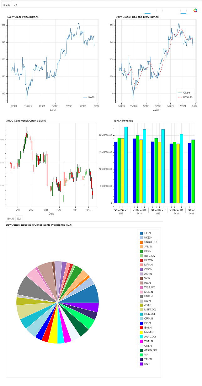
Pie Chart
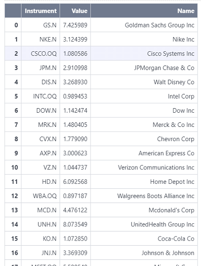
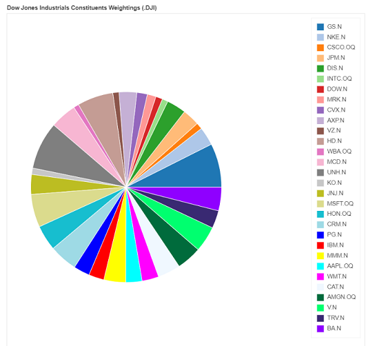
This example plots a pie chart that shows the weight percentage of the constituents in the Dow Jones Industrial Average Index.
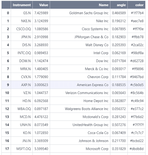
First, it calls the get_data method to retrieve the constituents and the weight percentage of the constituents in the Dow Jones Industrial Average Index. Next, it renames the column names so they can be easily referred to by Bokeh.
df4, err = ek.get_data('0#.DJI', ['TR.IndexConstituentWeightPercent','TR.CommonName'])
df4 = df4.rename(columns={"Weight percent": "Value", "Company Common Name":"Name"})
df4
Then, it adds the following columns to the data frame.
- angle: The angle of each sector in the pie chart. It is calculated from the weight percentages.
- color: The color of each sector in the pie chart
These columns are used by Bokeh to plot the pie chart.
df4['angle'] = df4['Value']/df4['Value'].sum() * 2*pi
df4['color']= ['#1f77b4', '#aec7e8', '#ff7f0e', '#ffbb78', '#2ca02c', '#98df8a', '#d62728', '#ff9896', '#9467bd', '#c5b0d5',
'#8c564b', '#c49c94', '#e377c2', '#f7b6d2', '#7f7f7f', '#c7c7c7', '#bcbd22', '#dbdb8d', '#17becf', '#9edae5',
'#0000ff', '#ff0000', '#ffff00', '#00ffff', '#ff00ff', '#F0F8FF', '#006B3C', '#00FF6F', '#392972', '#8F00FF']
df4
Next, it creates a new figure and then add the pie chart to the figure. It uses the angle and color columns in the dataframe to determine the angles and colors used in the pie chart.
figure5 = figure(plot_height=800,plot_width=800, title="Dow Jones Industrials Constituents Weightings (.DJI)", toolbar_location=None,
tools="hover",tooltips="@Name (@Instrument): @Value", x_range=(-0.5, 1.0))
figure5.wedge(x=0, y=1, radius=0.4,
start_angle=cumsum('angle', include_zero=True), end_angle=cumsum('angle'),
line_color="white",fill_color='color', legend_field='Instrument', source=df4)
figure5.axis.axis_label=None
figure5.axis.visible=False
figure5.grid.grid_line_color = None
show(figure5)
row_layout = column(row(children=[figure1,figure2]), figure3)
show(row_layout)
grid_layout = gridplot([[figure1, figure2], [figure3, figure4]], plot_width=500, plot_height=500)
show(grid_layout)
panel1 = Panel(child=grid_layout, title='IBM.N')
panel2 = Panel(child=figure5, title='DJI')
tabs_object = Tabs(tabs = [panel1, panel2])
show(tabs_object)
Summary
Bokeh is a Python library for creating interactive visualizations for modern web browsers including Jupyter Notebook. This library is available in Refinitiv CodeBook. Therefore, developers or data scientists can use this library to visualize financial data retrieved from Refinitiv's APIs.
This article provides several examples that demonstrate how to use Bokeh in Refinitiv CodeBook to plot charts from the data frames returned from the Eikon Data API. Moreover, it also shows how to arrange charts with the Bokeh row, column, grid, and tabbed layouts.
References
- Cochran, S., 2019. 6 Reasons I Love Bokeh for Data Exploration with Python. [online] towardsdatascience. Available at: https://towardsdatascience.com/6-reasons-i-love-bokeh-for-data-exploration-with-python-a778a2086a95 [Accessed 18 August 2021].
- Dobler, M. and Großmann, T., 2020. Data Visualization Workshop. 1st ed. [S.l.]: Packt Publishing.
- Developers.refinitiv.com. n.d. Eikon Data API | Refinitiv Developers. [online] Available at: https://developers.refinitiv.com/en/api-catalog/eikon/eikon-data-api [Accessed 18 August 2021].
- Stack Overflow. 2020. How to get Bokeh hovertool working for candlesticks chart?. [online] Available at: https://stackoverflow.com/questions/61175554/how-to-get-bokeh-hovertool-working-for-candlesticks-chart [Accessed 18 August 2021].
- Jolly, K., 2018. Hands-on data visualization with Bokeh. 1st ed. Packt Publishing.
- Ray, S., 2015. Interactive Data Visualization using Bokeh (in Python). [online] Analytics Vidhya. Available at: https://www.analyticsvidhya.com/blog/2015/08/interactive-data-visualization-library-python-bokeh/ [Accessed 18 August 2021].
- Refinitiv.com. n.d. Refinitiv CodeBook. [online] Available at: https://www.refinitiv.com/en/products/codebook [Accessed 18 August 2021].
- Ven, B., 2021. Bokeh. [online] Bokeh.org. Available at: https://bokeh.org/ [Accessed 18 August 2021].
- Docs.bokeh.org. n.d. Gallery - Bokeh 1.4.0 documentation. [online] Available at: https://docs.bokeh.org/en/1.4.0/docs/gallery.html [Accessed 18 August 2021].
Downloads